Donald Holder – Supple Light
Posted on May 3, 2022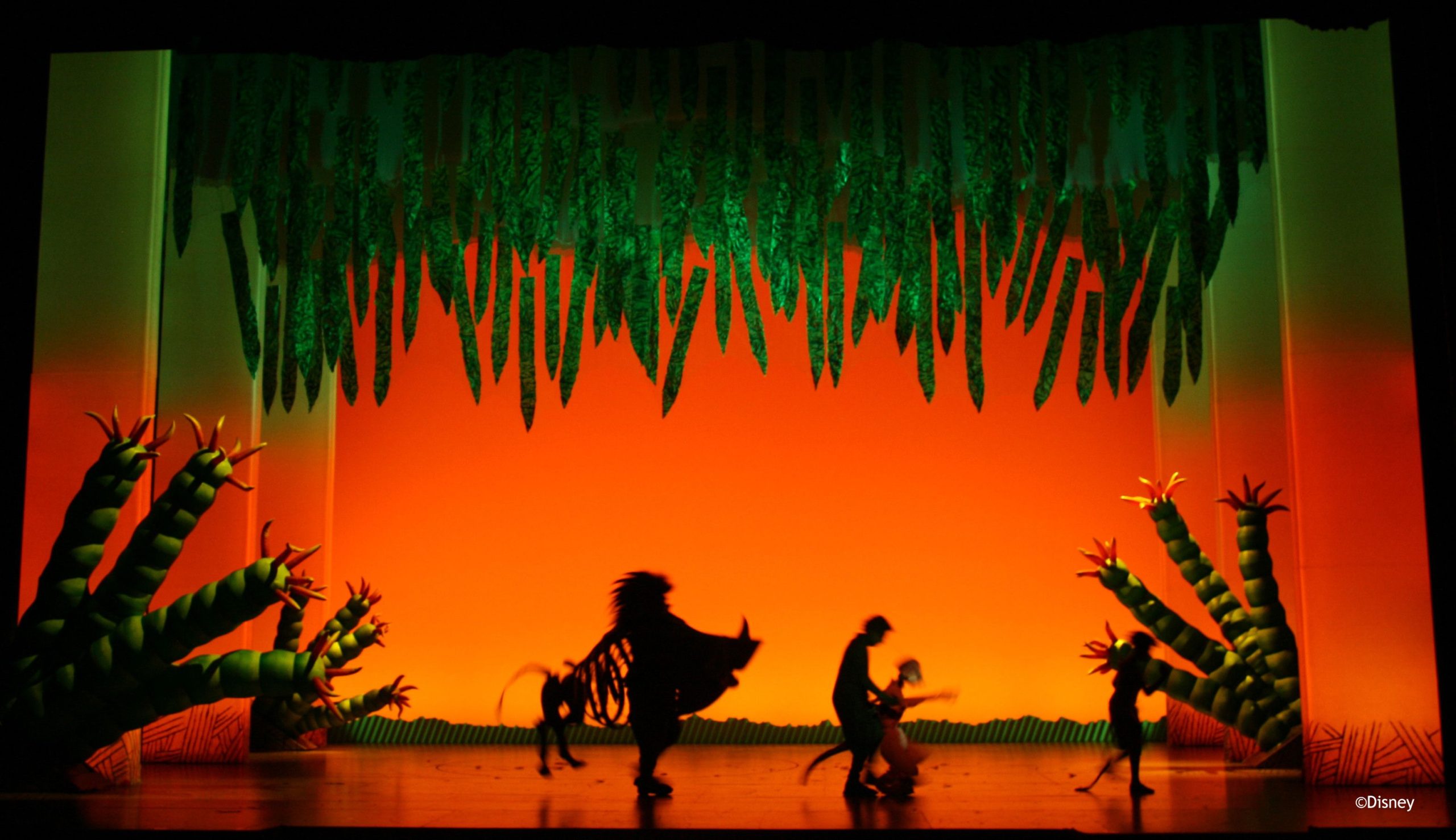
Infinitesimal numbers, a cornerstone of Newton’s calculus, are also a wonderful, liberating metaphor, reminding all who take the time to ponder their meaning that endless possibilities exist, even within strictly defined spaces.
The work of this New York lighting designer is, in many respects, a celebration of this principle. Always paying meticulous attention to the details that define the parameters of light in a play, film or television program, he has, over the course of his distinguished career, found endless ways to shape his designs inside those boundaries to reflect the contours of a show’s artistic intent.
Following this mindset, Holder has consistently kept his work, fresh, original and vital. Even when lighting a revival of a perennial classic, he still seeks to expand his design with new ideas, while remaining true to the original meaning of the show. Doing anything less would, he says, risk falling into what he describes as formulaic patterns.
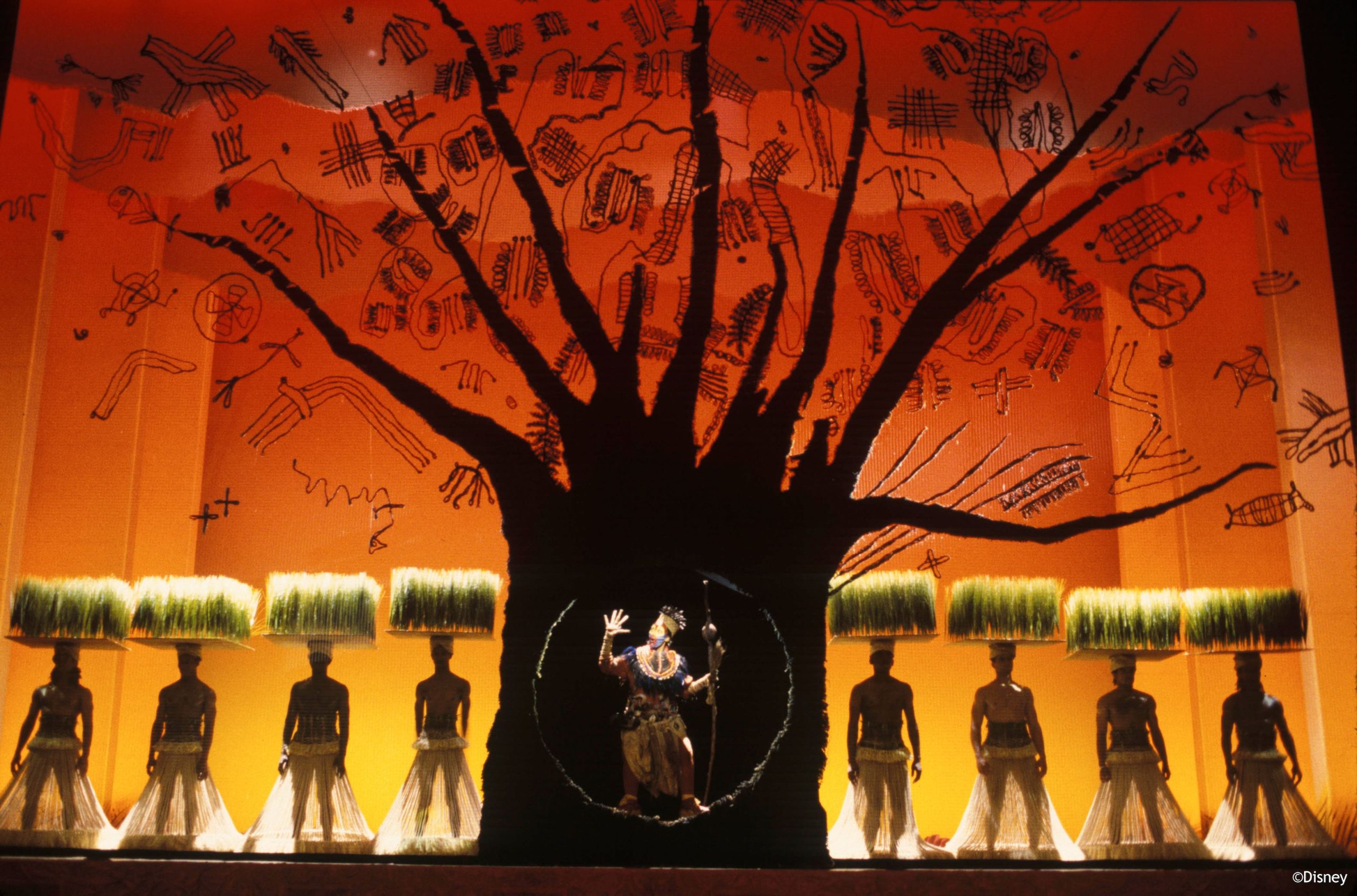
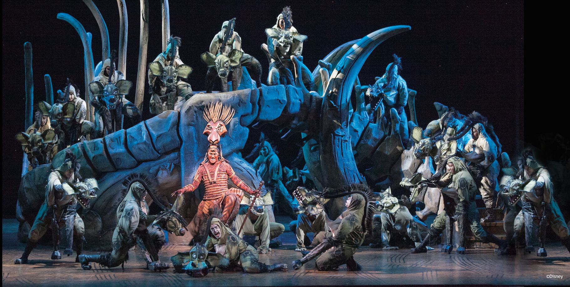
In 1998, Holder won the first of his two Tony Awards for “The Lion King.” Some 20 years later, he updated his design for the play, which is still in production, by converting to an all LED rig.
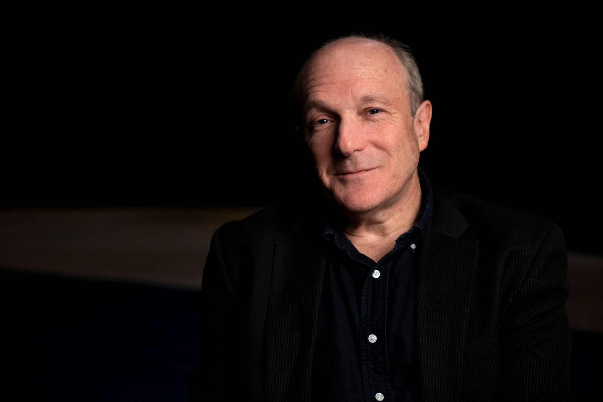
In addition to his two Tony Awards (the other was for the 2008 revival of “South Pacific”), Holder has been nominated for the honor 11 other times. Outside of Broadway, he has designed for New York Metropolitan Opera productions, as well films (Warner Bros. “Oceans 8”), and television programs, such as “Smash” for NBC/DreamWorks, and “The Marvelous Mrs. Maisel” for Amazon.
Speaking to us from his studio, Holder shared insights into the infinitely adaptive power of lighting design.
You won Tony Awards for “The Lion King” and the Lincoln Center revival of “South Pacific.” Do you approach a project differently when it’s a new show or a revival?
“I believe we’re obligated to approach the design of a revival no differently than we would for a new play or musical. As a creative team, we’re interested in looking at the work from a fresh perspective, crafting a unique visual landscape that will breathe new life into the work, making it resonate and feel relevant to a contemporary audience.”
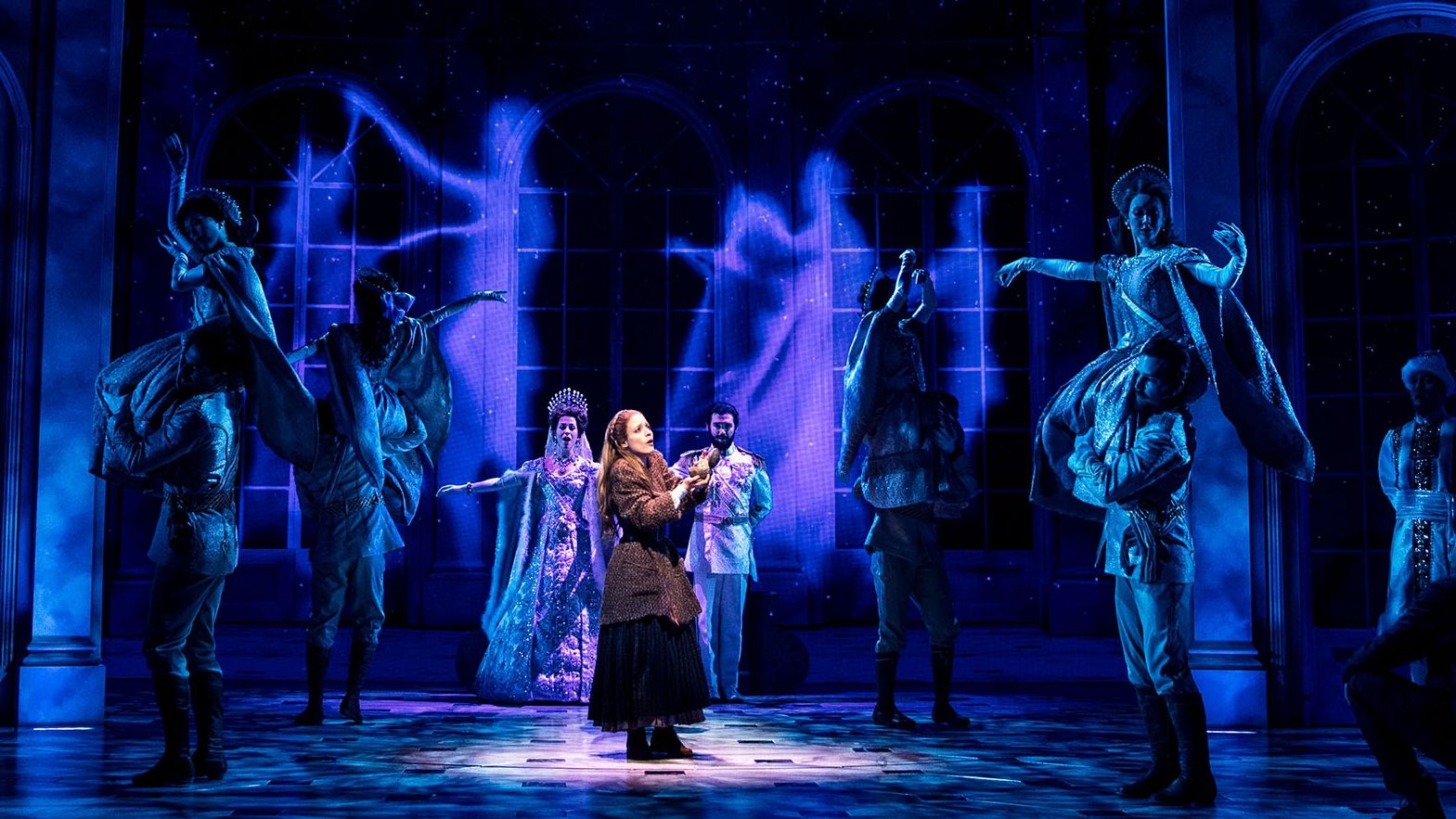
Photo: Matthew Murphy
On the subject of “The Lion King,” a couple of years ago, you updated the looks of that show, which is still running strong, by replacing the tungsten fixtures with LED units. What did this move add to your freedom as a designer?
“We’ve been slowly transitioning to LED sources in all of our productions since a 2012 UK Tour, where we successfully replaced all the tungsten-halogen strip lights with linear LED fixtures for the first time. Given the emergence of increasingly sophisticated (and brighter) LED automated luminaires, along with a viable LED alternative to the ellipsoidal reflector spotlight, we have largely replaced all of the tungsten sources in our newly minted productions, and we continue to transition toward all LED in our longer running ‘Lion Kings’ across the globe.
“The switch to LED was not a design driven choice, but rather borne out of necessity. There was a real need to reduce power consumption, especially on our touring productions. In addition, many of the tungsten halogen lamps we relied upon were banned or being phased out. So, once we landed on a product that served our very specific needs, we immediately began the transition.
“That’s not to say that the move to LED didn’t also offer its distinct advantages, the most significant being the ability to deliver much brighter and more vibrant skyscapes, while remaining faithful to the original color palette of ‘The Lion King.’ This is something that has always been a high priority for us.”
You’ve worked on a wide range of products from comedies like “The Little Dog Laughed,” to intense, often grim, dramas like A Street Car Named Desire.” How does the role of lighting differ in these situations? As a lighting designer, do you get into a different creative mindset when you light one type of show verses another?
“A lighting designer reveals the world of the play: we craft a distinct visual landscape for every production, each with its unique set of rules or parameters. The rules are determined by the text, narrative, music, directorial vision and the intentions of my collaborators. And the guardrails within which we create will inevitably shift and change with each new production. So it’s always my objective to be like a chameleon: adapt my visual approach to the needs and the vision of the project at hand. Trying to follow this mindset keeps the work fresh, challenges me to push my own creative boundaries, and allows me to avoid falling back on a safe or formulaic approach.”
You’ve also worked on television products like “The Marvelous Mrs. Maisel “and films like “Ocean 8.” From a design standpoint, how do each of these compare to theatre?
“That’s a very big question that could easily fill an entire magazine article — or more. But to be brief: I’m typically asked to design a theatrical lighting sequence within a film or television series, so I proceed using very similar techniques as I would for a live audience. The big difference, is that despite the possibility of an actual audience in-frame, the work that we create is photographed from the camera’s perspective. And the camera not only sees differently than the human eye, but it also sees everything, meaning that any given sequence will be shot from multiple angles, from the wings, from behind the performers, or via Steadicam, which is usually onstage, moving through the action as it unfolds.
“This requires a great deal of internal cueing that must be in sync with the camera movement. And the quality of light must be massaged to be sympathetic to the camera’s sensor versus the human eye. This means adjusting color temperature and intensities, smoothing out extreme variations in color saturation, and other accommodations for the camera settings. Theatrical lighting at its essence is created for the wide or master shot, but the camera will invariably move in very close to the action. The angles of light that may look great in live performance are not nearly as successful with portraiture – so we must adjust our techniques to take this important consideration into account.
In addition to your own career as a designer, you’ve been active in education, teaching college students lighting design. If you had to sum it up in a sentence or two, what are the critical lessons you hope students take away from your course?
“There are so many important lessons, but I’ll limit my response to three: First is the importance of preparation, attention to detail and mastery of technique. Second is to see technology as a means to an end; all of our creative and technical decisions must relate to the narrative and the overall point of view. Third is to understand that communication is key if one hopes for any success as a designer.”
Is there a certain quality that students who ultimately make it as lighting designers all share?
“A passion for the craft, strong work ethic, creative thinker, excellent communicator, natural eye for composition and detail, as well as an inherent sense of musicality.”
What are the things about lighting design that you can and can’t teach?
“We strive to develop a student’s facility and intuitive understanding of the medium of light and their command of technique, offering intensive training in the skillsets they’ll need to either make their own work, or to assist others in the commercial arena . We give them a firm understanding of process and of professional practice: how to organize one’s thinking and navigate the long journey from first reading of the script through opening night, and we try to give them the self-confidence to make bold and original artistic choices.
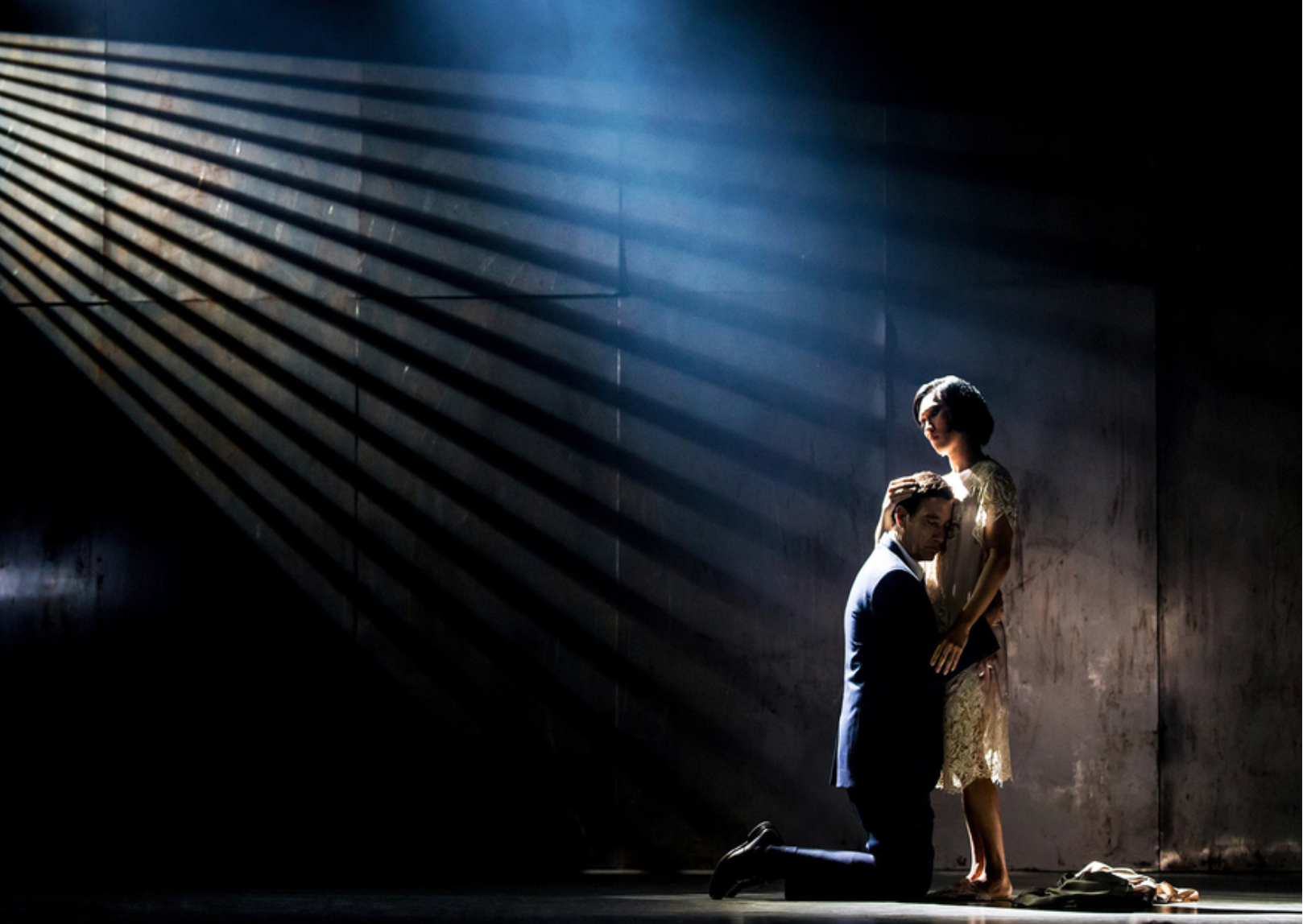
Photo: Matthew Murphy
“We cannot create imaginative thinkers, but we can certainly nurture and encourage the ones who possess this innate ability. We cannot teach our students to see, give them a sense of musicality, an eye for detail and composition, the ability to formulate and express creative thought. These are gifts — perhaps some yet be unearthed — that one must bring with them to their training.”
LED technology, moving fixtures and other advances have expanded the creative tool chest of lighting designers, allowing them to make even greater contributions to a show. Does this change the expectations of students? Does it change the way lighting designers collaborate with directors and set designers?
“The ever-expanding capabilities of a single lighting fixture have made it possible for LDs to take maximum advantage of the limited hanging space available to them in most theatrical productions. This in turn has allowed the incorporation of many more lighting ideas, a huge expansion in color possibilities, and a level of specificity and detail in every moment of a show that was previously unimaginable.
“Given the almost unlimited flexibility now available and the huge range of options these new technologies offer, I’ve observed a tendency in some students to avoid making firm decisions, such as specific color, position, beam angle, and so forth for a single fixture or even an entire rig. They believe that ‘winging it’ versus doing the homework and carefully considering every choice in advance is a viable option. I continually stress to our students that even the most sophisticated tools are meaningless without deploying the proper ‘paintbrushes’ for the proper job, with objective of bringing strong creative choices to life.
“Ultimately, yes LEDs have certainly brought vastly increased capabilities to the lighting designer’s toolkit. They have enabled us to work much faster and to become quite nimble in response to change and exploration, something which is an inevitable part of the collaborative process.”
How do you get inspired at the start of a project? Is there one element of a show that you tend to focus on first?
“Narrative and storytelling are usually the first aspect of the work I’ll respond to, and then I’ll move on to place it all in the proper context by reading background and source material, always searching for artists and images that speak to the work on both visual and metaphorical terms. I’m usually quite inspired by the research that my collaborators also bring to the table.”
Do you procrastinate at the start of projects?
“I wish I could say I don’t procrastinate, but I think I’m sometimes guilty of this tendency. Especially when I’m trying to juggle multiple projects in various stages of production. Usually the first one up gets the bulk of my attention, consumes more time than I had hoped, leaving little for all the others. I’m sure the struggle to prioritize when everything seems to be a priority is a challenge that most of my colleagues also face — at least I hope I’m not the only one who deals with this on a regular basis.”
Earlier, we asked about LED technology. Another technological change has been the arrival of LED video walls and projection videos on stages. How has this impacted your work as a designer?
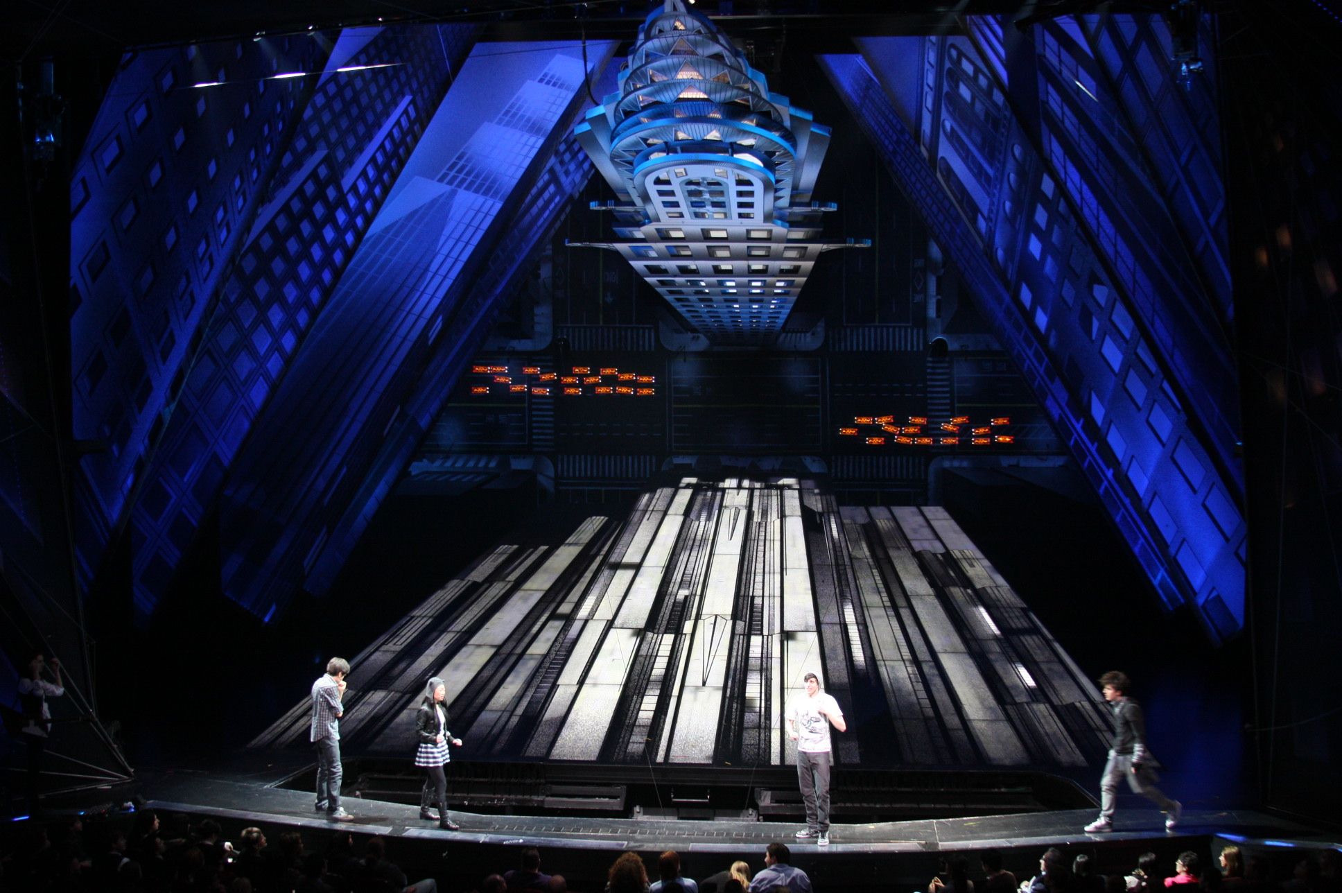
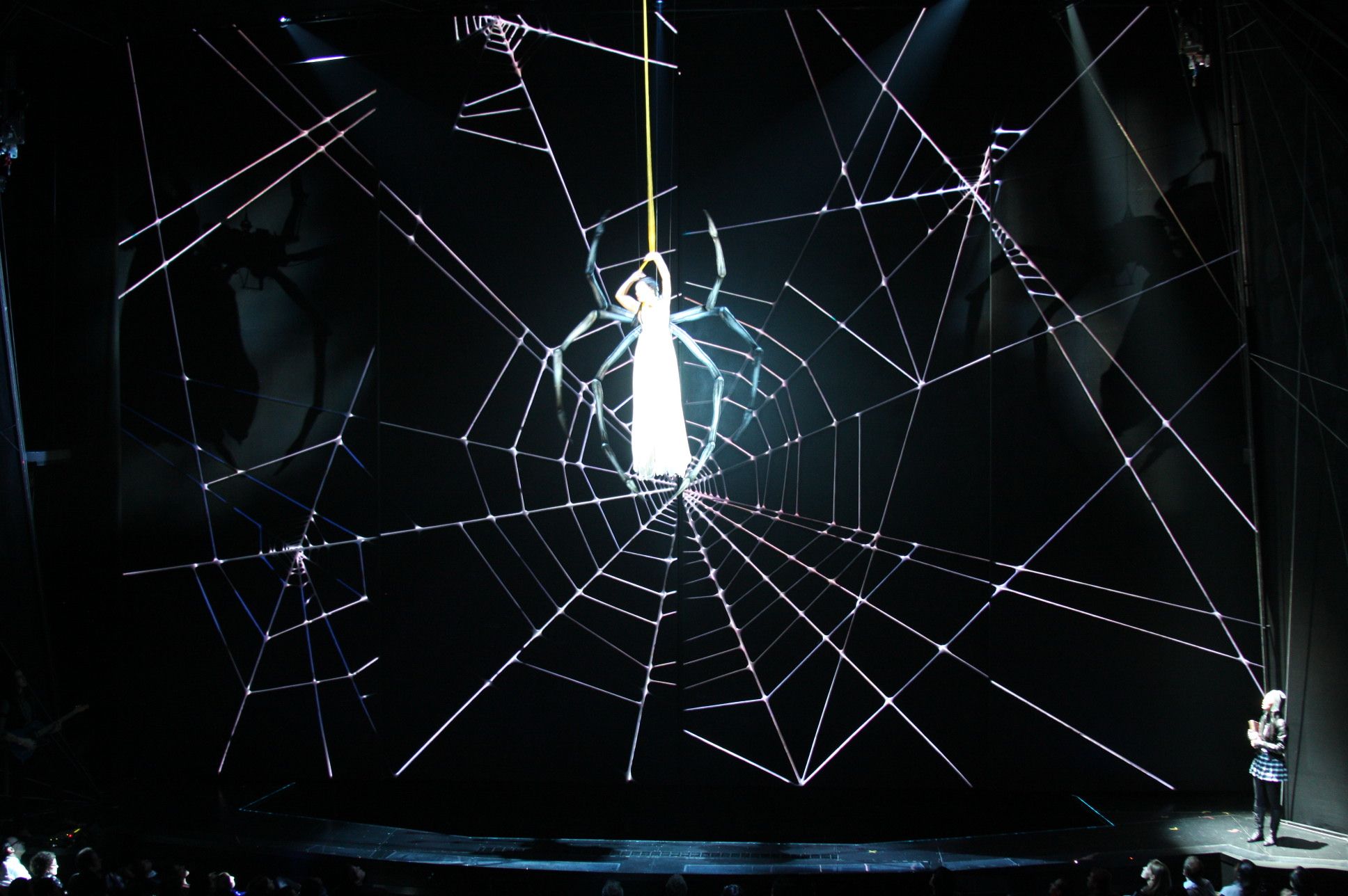
“Since the early days of our profession, the lighting designer was responsible for revealing the entire stage picture, from the surround, back wall or luminous cyclorama to the foreground. The surround, which might include a sky drop or cyclorama was a crucial storytelling element. ‘The Lion King’ is a perfect example of this. In the last 10-15 years the sophistication and brightness of video technology has vastly increased. This has made it possible for designers to replace the traditional cyclorama with video walls that can render dynamic backgrounds with incredible detail, movement of color and imagery that would have been unachievable using traditional stage lighting technology.
“The Broadway musical ‘Anastasia’ is another great example. In this case the bulk of the storytelling (locale, time of day, weather and even color palette) was determined by video content streamed into a full width ‘backdrop’, along with video panels embedded within the windows of a semi-circular wall that framed and defined the foreground.
“Since so much of the visual storytelling was communicated via two-dimensional video panels, it was crucial that we create a sculptural, living light which married the background and foreground into a singular three- dimensional space. This required a lot of close coordination with the video designer Aaron Rhyne, particularly when it came to color-matching, synchronizing movement effects, and the rendering of highlight and shadow. Video walls, which feature LED diodes in direct view of the audience have the potential to be incredibly bright. It’s very important for the LD and Projection Designer to arrive at a comfortable intensity balance to avoid over-lighting the foreground in order to compete with an excessively-bright background.”
On the subject of brightness, or lack thereof, you make excellent use of shadows and dark spaces in your designs. Rather than minimizing them, you give them room on stage. Any advice on how not to be afraid of the dark?
“The presence of shadows and darkness are equally important as light in revealing shape, and in the truthful rendition of a living and breathing three dimensional space. We encounter shadows both realistically and metaphorically in every aspect of our lives. If we are tasked to illuminate work that speaks to the core of the human condition, then shadows are as much a part of that picture as is light.”
What made you want to become a lighting designer?
“I’ve been fascinated with light from a very early age. As a Boy Scout, I was always the kid who volunteered to build the campfires and bonfires, illuminate the ceremonial trails. At the age of eight or nine I began to actively observe the movement of light over the course of a given day, noting the increasing length of shadows, the shifting color of the sun as it traveled across the sky. My parents often took me to theatre in New York, and I still recall how fascinated I was with the stage lighting. I scanned the program for the name and bio of each show’s LD, searched the local library for any reading I could find on the subject. I joined the stage crew in middle school (age 13) and haven’t stopped since. Seeing Tharon Musser’s lighting for A Chorus Line on Broadway as a 17 year old High School Student was a pivotal event in my life. It was breathtaking, transformative work. Between the power of the light and the potency of A Chorus Line’s message, I believe it was this production that truly set me on the path that I would follow for most of my adult life.”
You also have a background in music and dance, has this helped your subsequent work as a designer?
“Understanding musical structure, vocabulary, rhythm and dynamics has been particularly helpful in my work on musicals and in opera. I can read music and speak comfortably in musical terminology. I can visualize the light when reading or listening to a musical passage. These skills have enabled me to formulate and communicate my intentions quite clearly, even when the music and not the text serves as my principal guidepost.
There is inherent musicality and rhythm in the writing of many plays and musicals; William Shakespeare and August Wilson immediately come to mind. I often respond to a play’s musical rhythms when designing the light, and I believe this imbues the work with yet another layer of meaning and detail.
You’ve accomplished so much in your career, is there a role played in the past by a great actor who is no longer with us that you wish you could have been around to light?
“Would have loved to light Marlon Brando in a work by Tennessee Williams, one of my favorite playwrights. ‘A Streetcar Named Desire,’ ,‘The Night of the Iguana,’ or ‘Cat on a Hot Tin Roof’,’ immediately come to mind.”
How would you like to be remembered as a designer?
“As someone who loved to work with light, but loved his family even more, who was passionate about the craft, who worked hard, was committed to nurturing the next generation of lighting practitioners, but equally committed to community service. He was perpetually a kid at heart, full of wonder and ambition, always striving to do better and to be better in his life and his art.”