David Howard’s Patterns in Light
Posted on October 3, 2023
Shapes have a language all their own. And, like every language, it is one marked by a vast web of meanings and complexities. After all, it is no accident that we explain the most abstract of all concepts, infinity, with a shape… Or, that we readily associate major religions with simple shapes.
David Howard understands this language well. He’s become quite adept at using it too, incorporating a variety of shapes and patterns into lighting designs for clients like Gary Numan, Myrkur, Jo Quail, and the Hoosiers.
In Howard’s hands, shapes are not merely static structures defining the outline of a stage; they are, instead, vibrant, organic entities that often evolve with a show to deepen its impact on audiences. Calling on a range of techniques, he empowers the geometric configurations he creates on stage, by molding them through colour, along with variations in shadows and brightness, as well as movement and video imagery.
Fresh from conducting seminars at PLASA London, Howard, the owner of David Howard Lighting Design, spoke to us about the power of patterns in light.

In many of your designs, you create a theatrical look on stage by framing the artist with various geometrical configurations of light, rather than have them live in a wash or 3D video background. Can you tell us a bit about the vision behind this design philosophy?
“Light should always compliment the artist; very rarely should it overwhelm. There are techniques and methodologies that frame artists on stage to make them appear bigger, to make them the focal point of the stage, or to make them shrink into the wider production in order to accentuate the music they’re making. Choosing which techniques to use and when to use them is really the job of the lighting designer. When lighting pop music, good key lighting often comes above all else, people have paid to see their favourite artists and making sure that they can be seen, and photographed, comes first. The wider lighting scheme should allow this to happen while also carrying the mood and feeling of the show creatively.”

Do different shapes convey different moods in your designs?
“That’s a very interesting question. Shapes can lend themselves to symbolism which is a hugely powerful tool when used appropriately. I often build shape in light that expands outwards from an artist, to draw the eye back down to them. For camera work, light often functions as a tool to fill voids in the back of shot, which sometimes dictates the shapes you can create on stage. For a project I’m working on at the moment, a heavy reliance on hexagons carries the design concept, to convey a futuristic and hugely geometric feel for the performance environment.”
In many cases, the geometric configurations you create are set off against a background of shadows and dark space. How would you describe the role that darkness and shadow play in your designs?
“As a designer, you should never be afraid of the dark. I very much believe that often 10 static beams well-focused against darkness carry more impact than 100 whizzing around throughout a song. I work with artists whose music celebrates the dark. Over lighting is as big a problem as underlighting, but again, the variety of performers I work with dictates that no rule is hard and fast. Recently, I’ve been working with artists whose stages and performances command a fuller stage environment. This skill in this is knowing what to deploy and when. Darkness is a tool that can be used as light can – providing the required contrast to make what you do with light actually stand out and have meaning.”
So, what are the biggest challenges when creating a design that characterized by geometric patterns and dark space?
“First and foremost, achieving that darkness is often a challenge. I recently toured through what was basically a tropical greenhouse for a daytime slot with an artist whose show relies on shadow and nuance. Situations like that require you to create the contrast and rise and fall in alternative ways. So, in that particular case I deployed smoke though the show at various points for added drama. I also used strobes in a more traditional eye candy manor, as opposed to as set, which allowed songs to be punctuated.”

You often used whites and ambers when creating these shapes. Does your approach change when you’re framing an artist in colour?
“The artists I work with vary so dramatically it’s hard to latch on to colours too strongly. There are a few artists I work with where I stick to colours from nature, and others like the Hoosiers for example where the entire colour palette for their recent 15th anniversary show was limited to Red Green Yellow and Blue, which were the block colours from their album whose birthday it was. The colour palette of a show very much stems from the overall show concept and builds as each individual song is designed.
“Generally, I’ll have a fairly tight colour scheme for a show. Just because today’s technology allows for every colour of the rainbow, I don’t think they all have to be used in a 90-minute performance. Reflecting back, deep ambers do indeed feature in Gary’ Numan’s current show, as well as Jo Quails and others. These warm saturated tones can really shift a mood in a performance, as can steel blues. I rarely use the true primaries; usually I opt to shift them slightly out from full saturation.”
You also have used shapes to frame video walls, the way you did for Gary Numan. What are the challenges involved in shaping video walls?
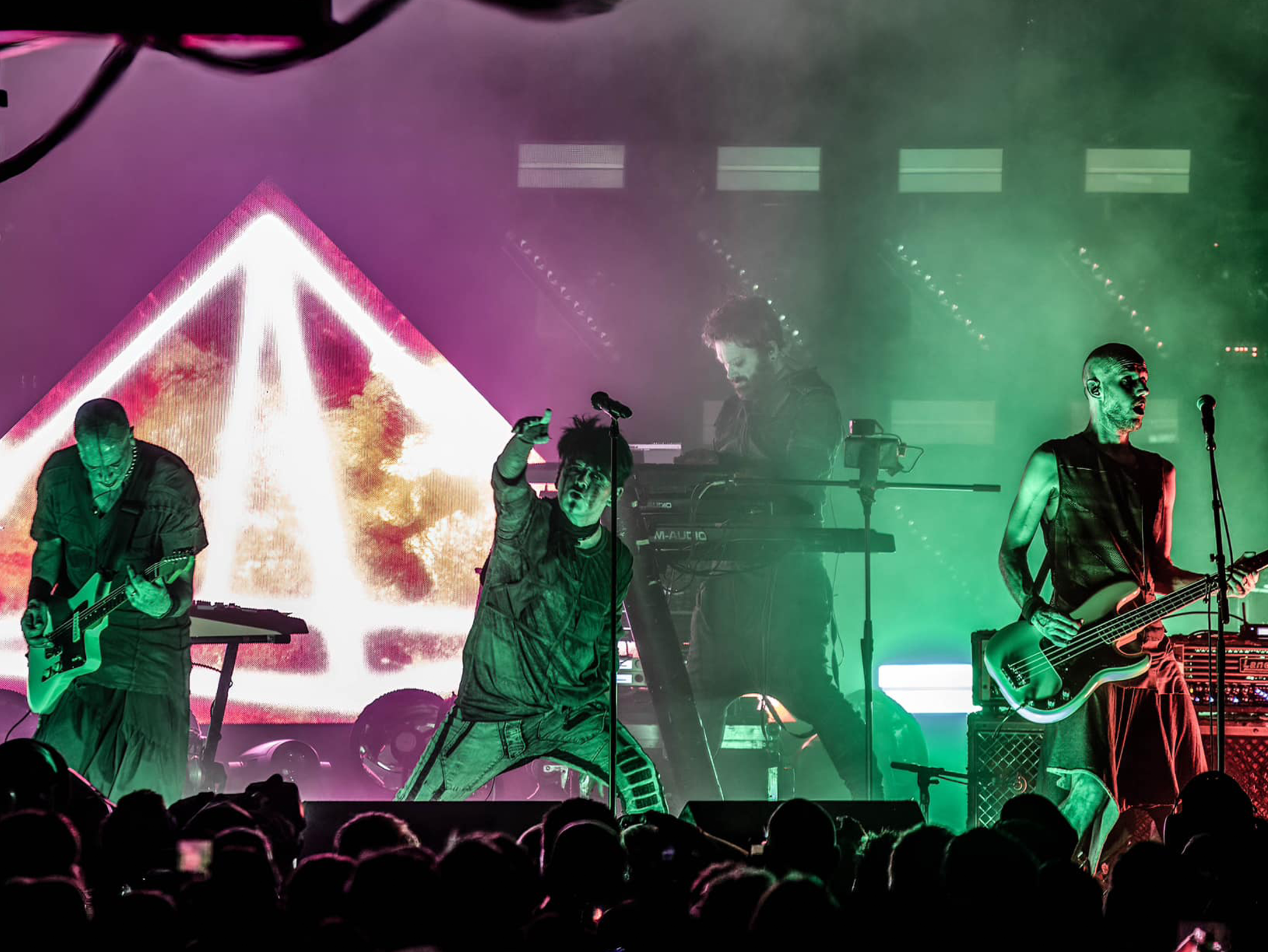
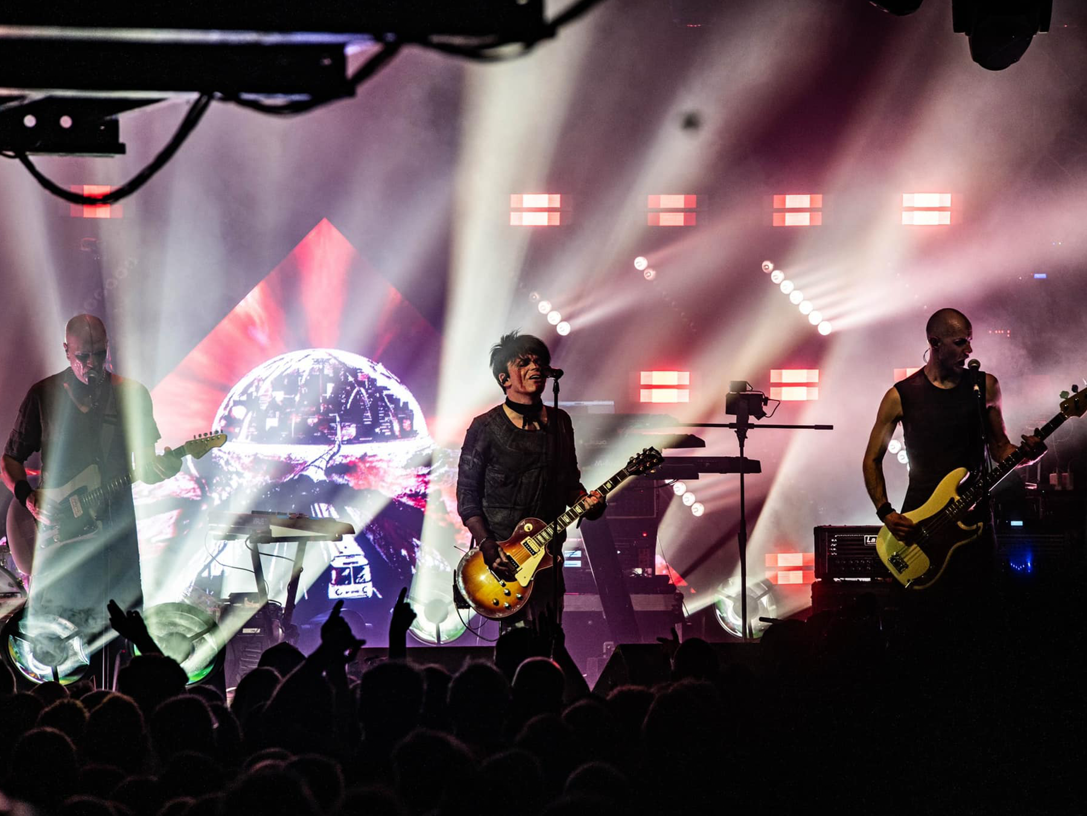
“Video is an artform that brings its own host of challenges. I work with skilled content creators to produce show content that fits each artist. I am currently really enjoying producing analogue content and seeing the effects of this on large screen elements. I really reject the ‘artist in front of a massive TV’ look of standard video walls. Instead, I try to use in alternative ways . This was the approach I followed with the Numan triangle centerpiece; or when I use non-standard methods or surfaces for projection.’
No design can be everything for every artist. Are there types of shows when you wouldn’t want to go with a design characterized by shapes and shadows?
“I’d say that generally creating shape on stage is a design style, but one style rarely fits all. For example, in prog rock and other more experimental genres, such as the music of Jo Quail, the function of light on stage shifts priority, and an overall stage image is considered. For one-artist shows, such as these, light should celebrate this dimension, while also filling the stage area so that the back row also feels immersed in the artistry on stage.
“In another case, I’m working on a stage concept currently that will make use of domestic lighting and vintage lamps to create a stage environment that celebrates an almost ironic nostalgia. The focus here will be on using these stage elements against a contrast video element to carry the show, with a decidedly less reliance on more beamy looks. I’d say generally, as an LD you help a show have visual identity, and this can happen in countless ways, though shape, form, intensity and colour. Choosing what to use and when has a huge impact on this identity.”