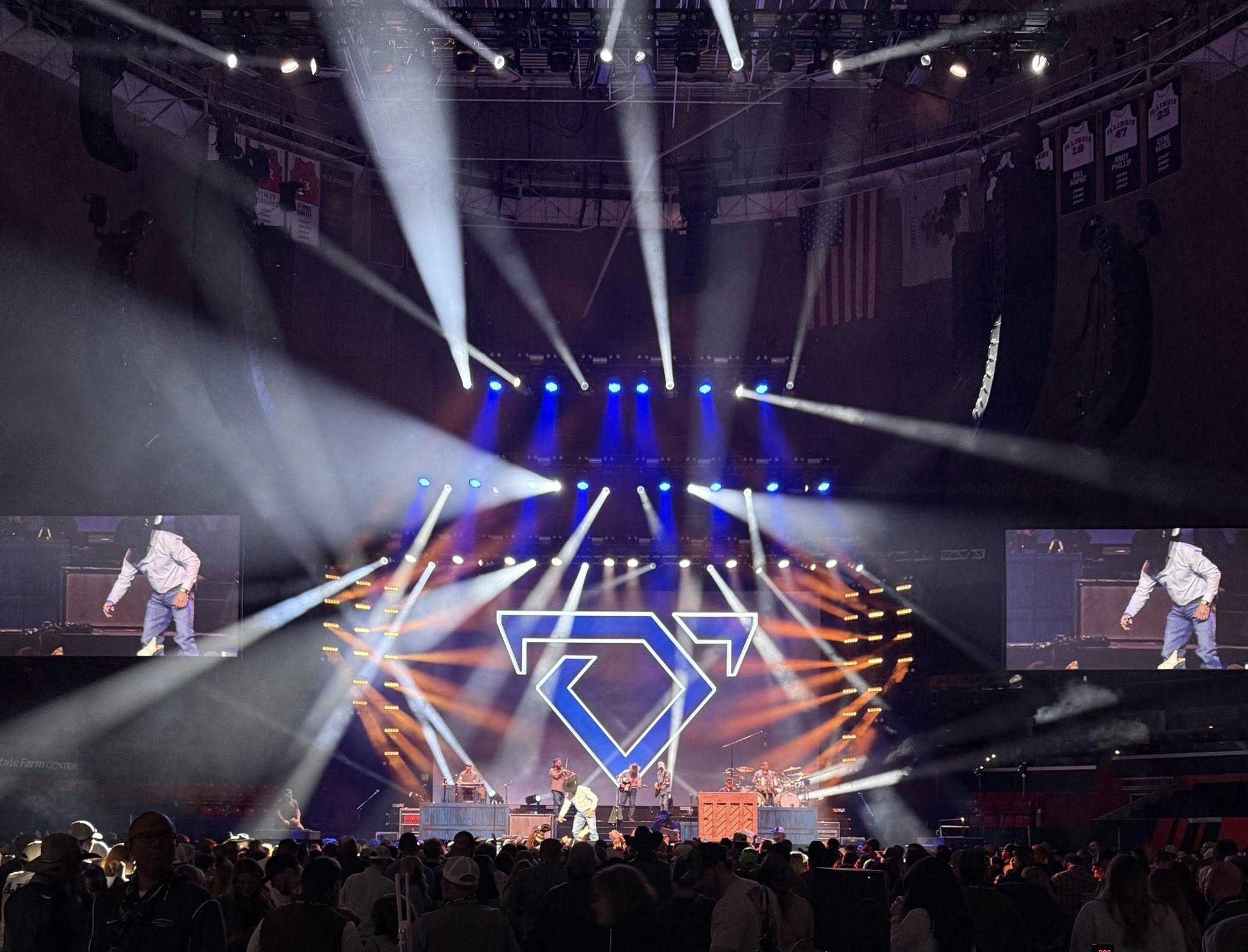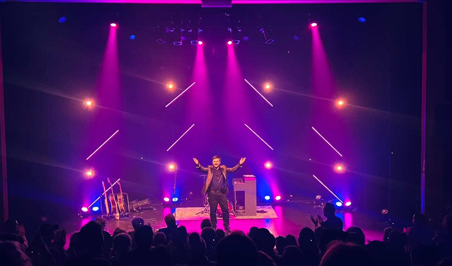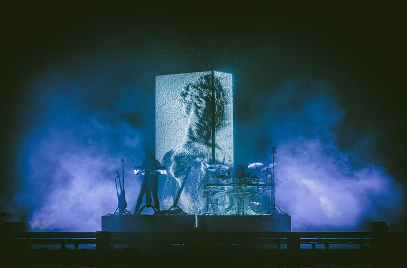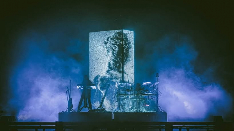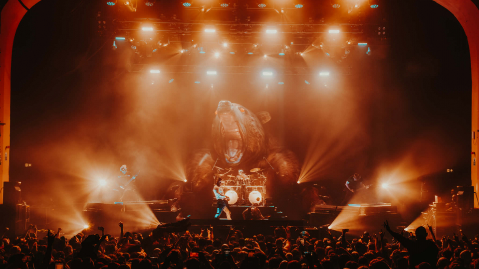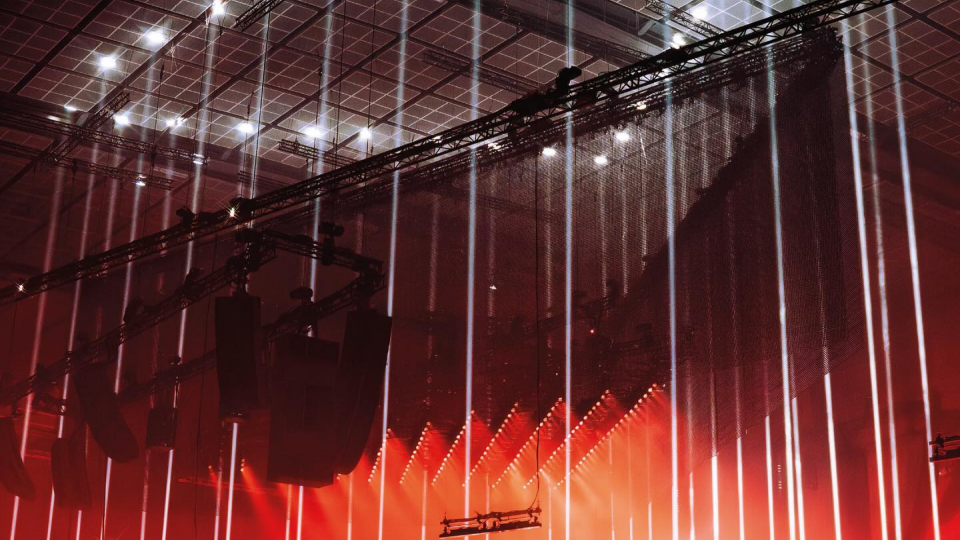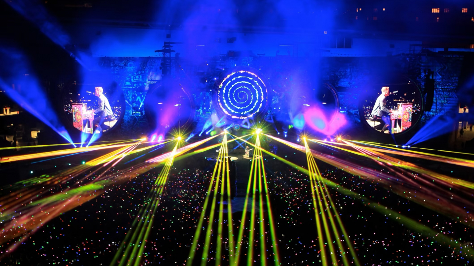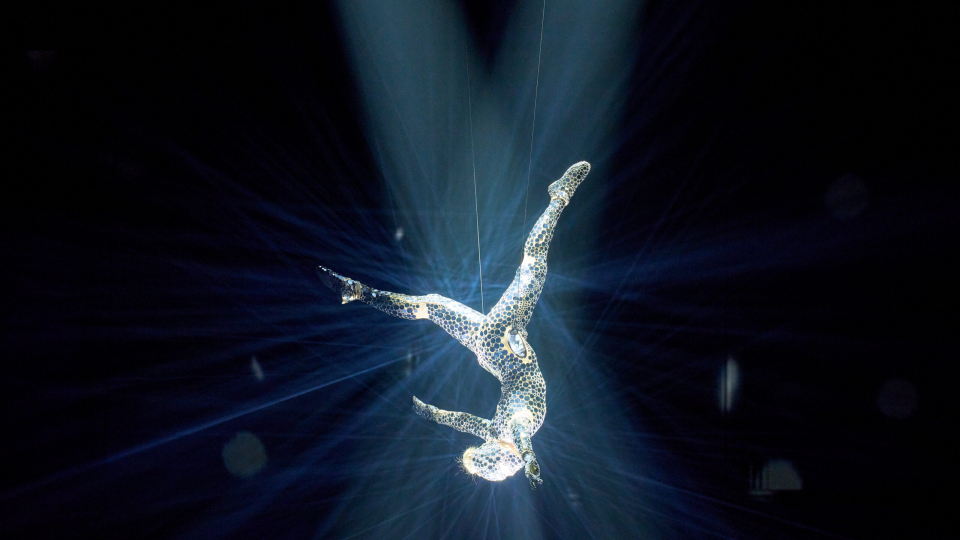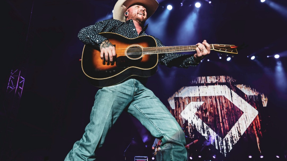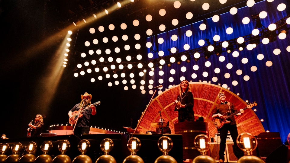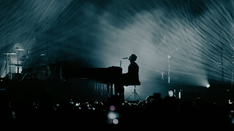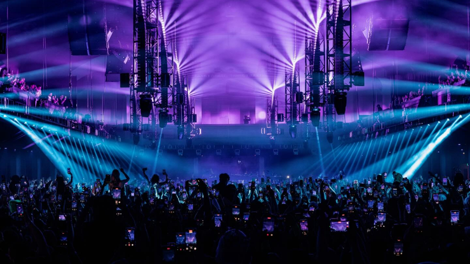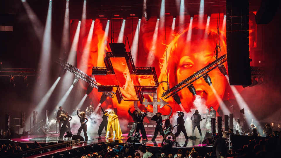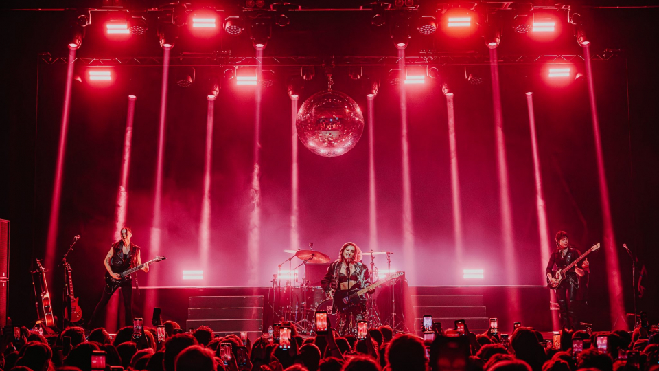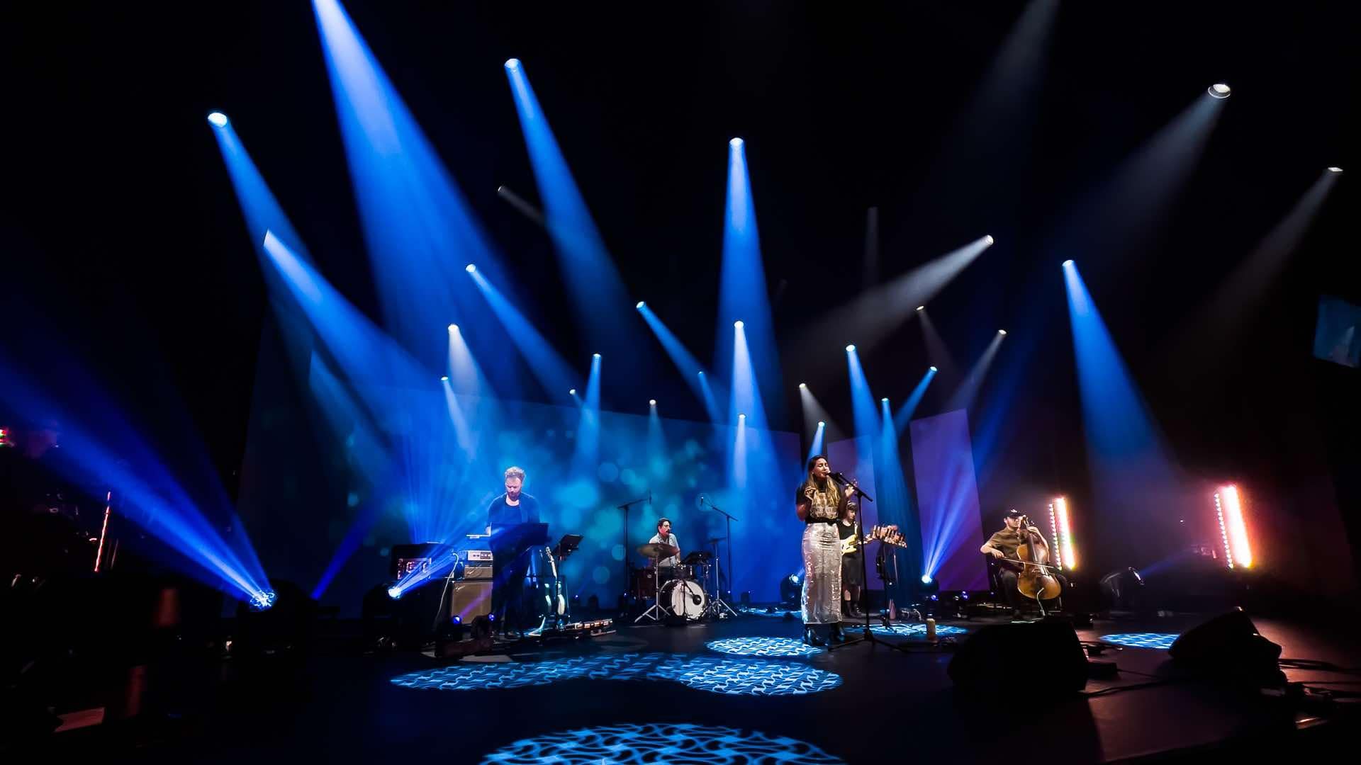
The photo stopped us in our tracks the first time we saw it on our friend, Gil Perron’s Facebook page, a beautifully balanced island of warm blue floating in a sea of black. Warm white light sculpted the blue, giving it greater depth and endowing it with a magnetic quality. The light settled gently on the performers on stage, making them glow in a way that seemed angelic. We could not hear the music these artists were making, but looking at the photo, they sounded beautiful.
Were we obsessed? Perhaps, but beauty often has that effect on people. We were so impressed with the photo that we contacted Gil Perron and asked if we could ask him some questions about the way he used color to bring this image to life. He graciously consented, and thus was born a new column for this publication called “Color Talk.” In it, we will be asking designers how their use of color contributed to a magical moment capture in a single photo.
There will be other stunning designs to come. In the meantime, though, we invite you to enjoy this moment, where power and beauty are balanced in perfect harmony.
This photo is stunning. What shades of blue were involved?
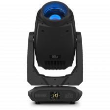
“For this project, I used almost exclusively one of my favorite instruments ever, the Maverick MK3 profile. Because this concert was recorded for broadcast, I wanted a light that could do everything a “show” light could do, but at the same time, could also deliver a stellar level of nice warm whites. As for your question — we had three levels of blue of six lines of lights. From back to front equivalent to L120, L132, L118. The lower density of blue permitted some of the “white” to shine through.”
Why did you select those shades?
“This is all about the artist and the vibe. Blue is blue… and blue conveys so much emotion, introspective emotion.”
The blue did not extend to the end of the set. You had some purples and ambers at one end. Why not all blue?
“Beyond the key lights, it was also important to bring some warmth to the scene, the sides were set to L151 to augment the richness of the instruments but also to return some natural feel to the skin tones. The floor package consisted of Hybrid lights and some beams, which I used in extreme saturates — L181 in this case — both to create a visual limit but also because the light sources where somewhat uneven from one instrument to the other….real life stuff!”
Your gobos were extraordinary. They seemed quite large. The patterns on the back wall seemed large too. Why was that? Does warm blue require bigger patterns?
“Well, that back wall is actually a video wall, so are the flats….you caught me! Being about to create the content based on the lighting design really makes everything homogenous. Even the color matching! As for the gobo choice. On the broadcast, the floor is never seen and the gobos are all about bring texture without being obvious breakups. Glass gobos are magical for that. On the picture, the positions seem awkward but it was all about beam stacking for camera…creating massive texture with 2 instruments per angle.”
What color temp of white light did you use?
“My personal favorite “camera” work temperature is always 4300k while setting my open lights to 4600K. It’s a great middle ground both for the camera team and the audience. I’m quite OCD about color temp, which is why I chose the fixture I did. It has a great CTO filter and an even greater CRI filter.”
The warm blues play off really well against the singer’s gold top and white skirt. Which colors do recommend using with warm blue? Are there any that you would absolutely avoid?
“As much as possible, I tend to work off the triadic color wheel, however, in this case, because there were many different acts to light without being to repetitive, I went with analogous and dual color scenes. For this scene it was blue vs light amber, Nothing complicated. There are tons of really great charts on the internet for anyone curious about color science.! The charts are a great starting point…but set pieces, wardrobe, skin tone and message must dictate the end result. Rules are not laws! As for what to avoid….if it’s not pleasing, it’s wrong!”
What does warm blue add to a look? How would the mood in the photo been different if you went with a lighter blue?
“Blue and red are equally powerful but diametrically opposed when it comes to emotions. As for green…well, green is my nemesis, let’s never mention green again! In my opinion, Blue is a tricky color, especially with LED light sources. Blue can easily fall towards UV or depending on the quality of the light engine, be overwhelmingly magenta. Blue is beautiful, but delicate. And sadly, blue can suck all the power out of your lights… so, blue is a minefield! I favor lighter blues over darker and I favor a light engine with a bit more green than magenta.”
Any further advice on using warm blues?
“Warm blues….such a gorgeous contradiction in terms! If anyone watches a “blue” scene created by a LD and feels warmth, I think that Designer achieved something great. It means that this person found a way to make the cold feel warm. Congratulations to that person, you inspire me.”
