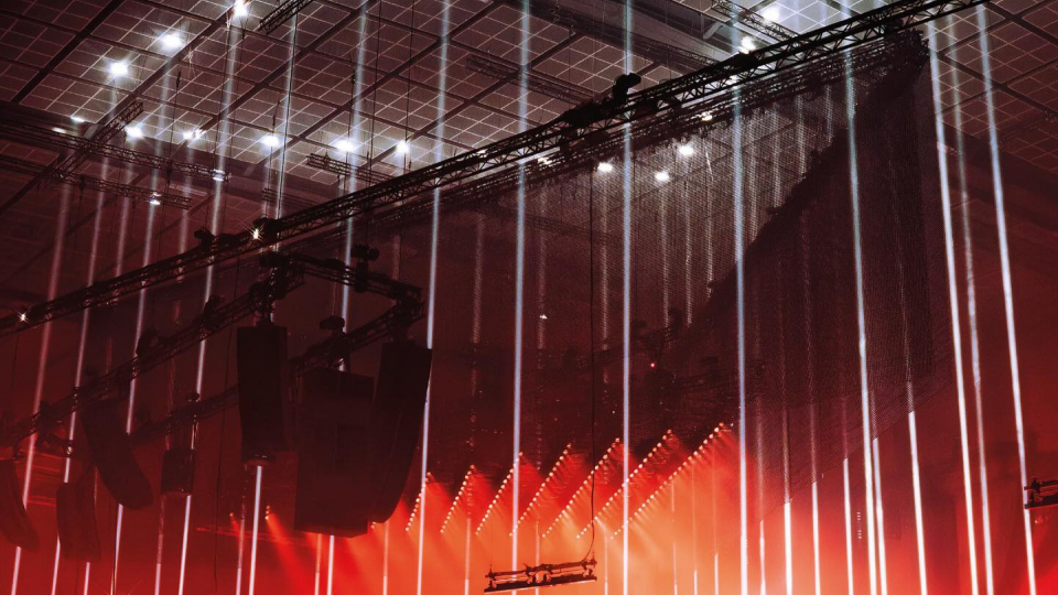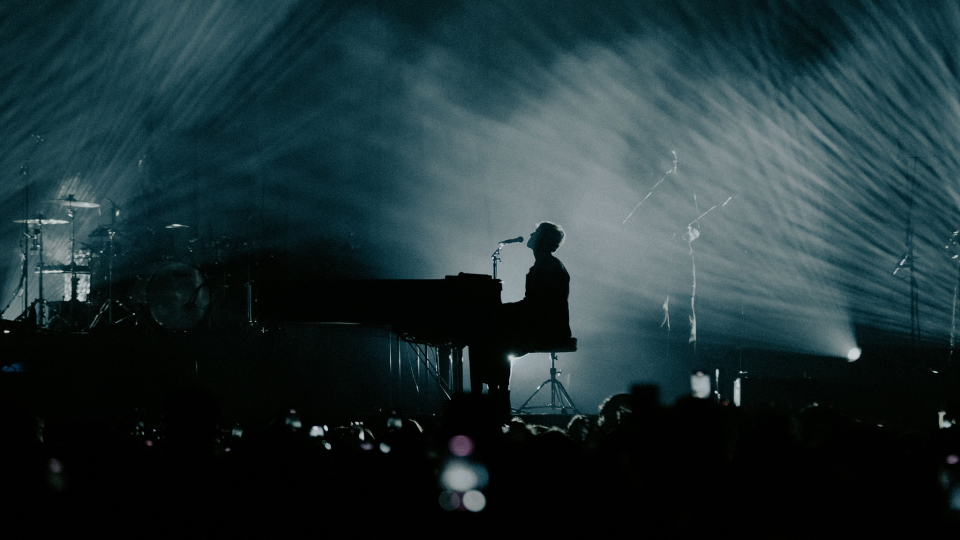
Say the word RED… Can any other colour evoke such powerful imagery just by having its name uttered? And what a range of images it is too! Often thought of as the most aggressive color, red burrows its way deep into the heart, unleashing an array of sensations, symbolizing revolution, turmoil, and anger on one hand, but passion, excitement and love on the other. Would any other colour do for Valentines Day?
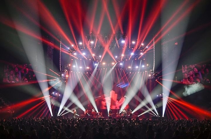
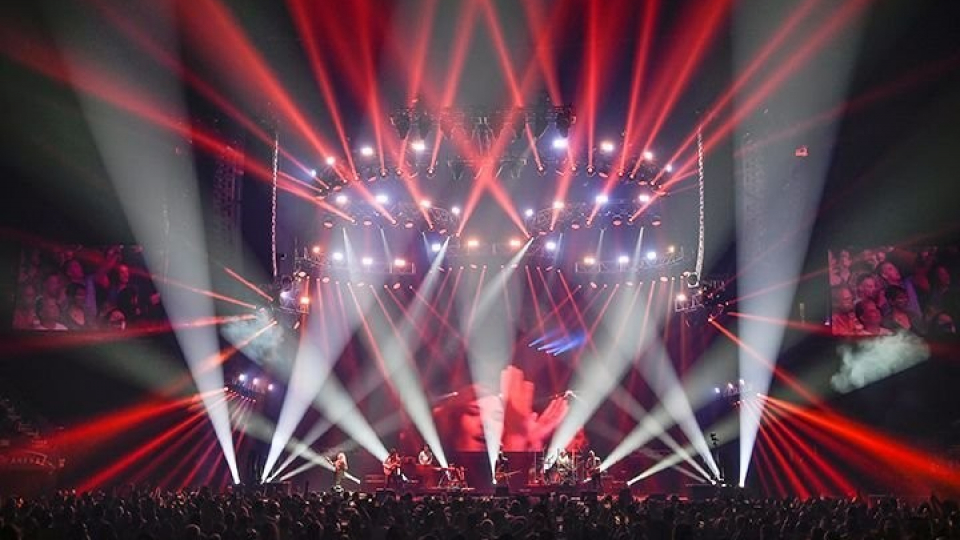
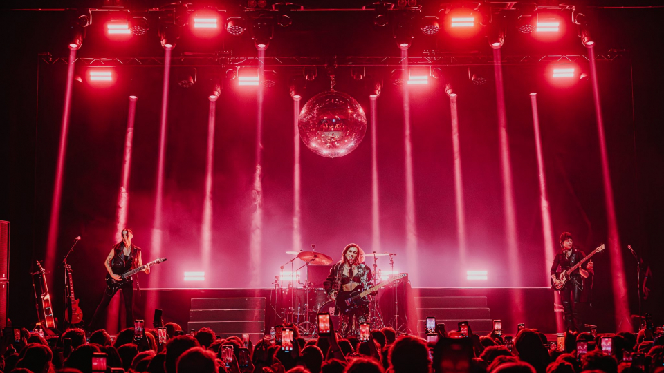
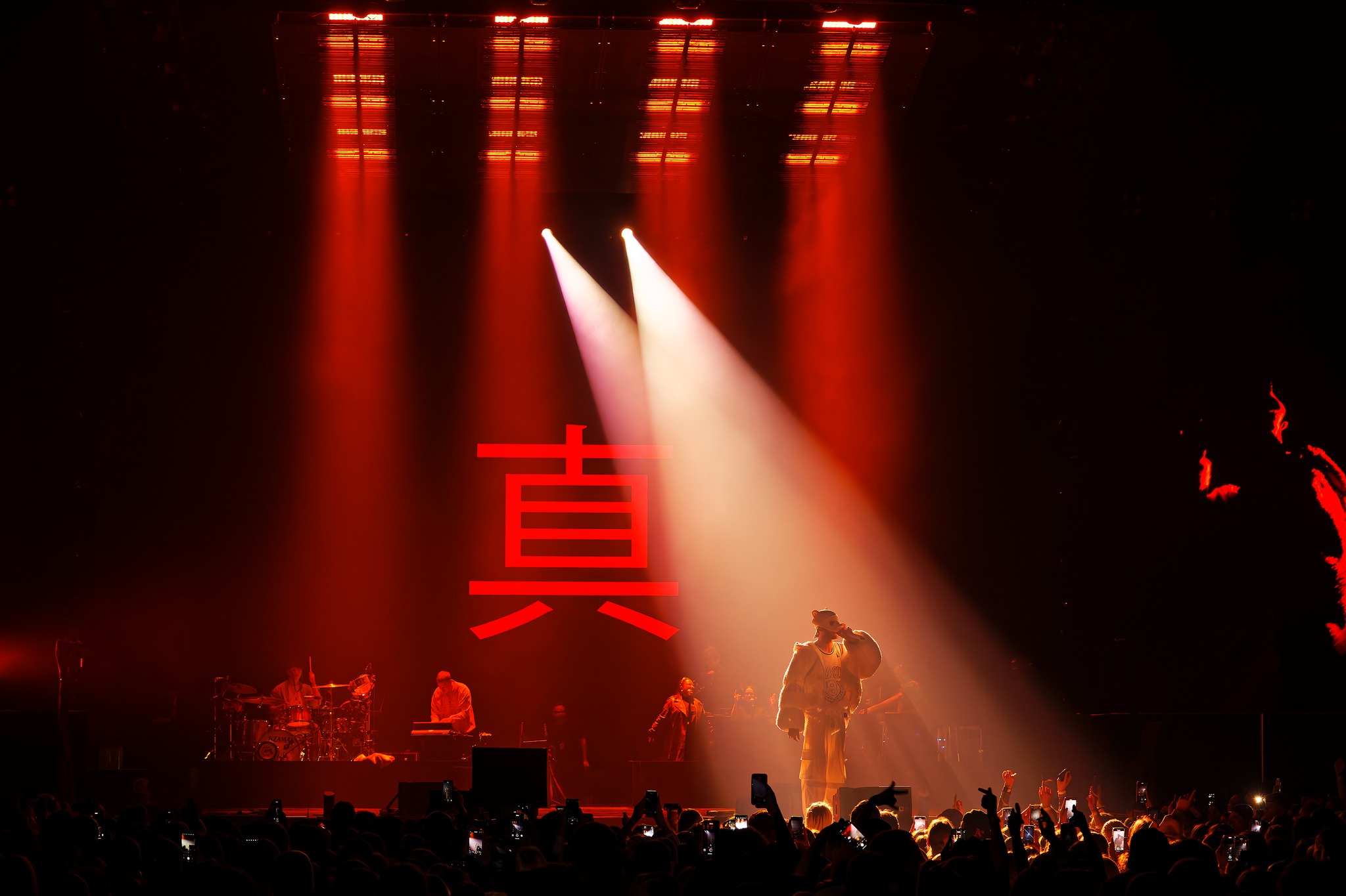
Acclaimed designer, Roland Greil managed to capture all the complexities of red in a single moment on the German arena tour by rapper Cro. His achievement is captured in this photo, which captivated the moment we laid eyes on it.
So much about red is here to absorb. There is the gentle cascade of red mixed with white getting softer and more velvety as it approached the artist. This contrasted sharply with the more menacing reds mixed with dark space at the edges of the stage. At the center was a deep, brilliant red that fueled the entire design, giving it its irrepressible energy.
The more we starred at the photo, the more we got lost in the infinite nuances of red. It was a liberating feeling, which, we suppose was at the heart of this design’s philosophy.
Your spot lighting on the artist was breathtaking in how it moved from white to varying shades of red as it descended. Can you tell us how you achieved that effect?
“It is a pretty simple magic trick as the colour gradients are a result of the overlapping lighting. Warm white from the hard edge fixtures backlighting the artist and a warm red from the soft lights above the LED screen ceiling.”
It was also captivating how you had two layers of spot lighting on the singer. Why two instead of one?
“The over lapping beams of light backlighting the principal added to the magic of the moment and worked perfectly fine with the overall look.”
What shades of red did you use?
“A warmer red from overhead in combination with a saturated red lighting the band in the background. Both worked perfectly with the warm white backlighting of the principal artist.”
What color temperature of white?
“Lovely warm tungsten white and therefore somewhere around 3200 Kelvin.”
The downlighting on the stage was all red. Why did you decide not to have any other colors in the background?
“I like simplicity and minimalism in colours and therefore once more stayed within a monochromatic world, which also allowed the headline artist in his warm white backlighting to stand out more.”
You had a lot of black space in this look. How would you describe the role that darkness played in your design?
“Without darkness/ black space there is no chance for light to stand out and work. Therefore, especially on this project we played a lot with black space to create a minimalistic and high contrast look and feel.”
How did this look with its dominant red theme reflect the music of your client?
“It perfectly worked with the theme of the specific song and also extended the look and feel of the video content visuals.”
Any advice on using red in design?
“Red is a very strong colour and could be used for many different reasons. Both for more intimate, laid back moments in a show, as well as also if you’re creating dramatic high energy looks.”