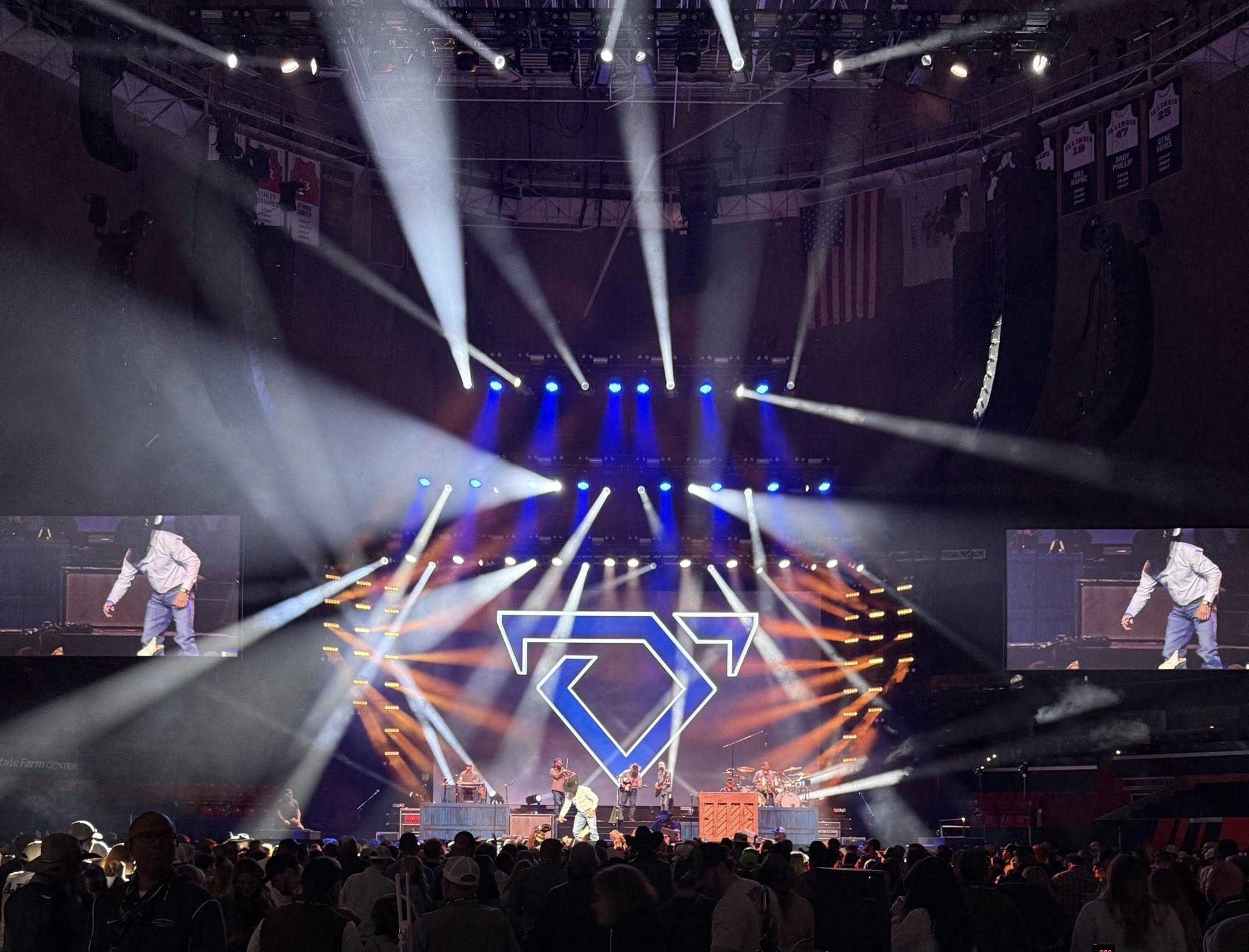
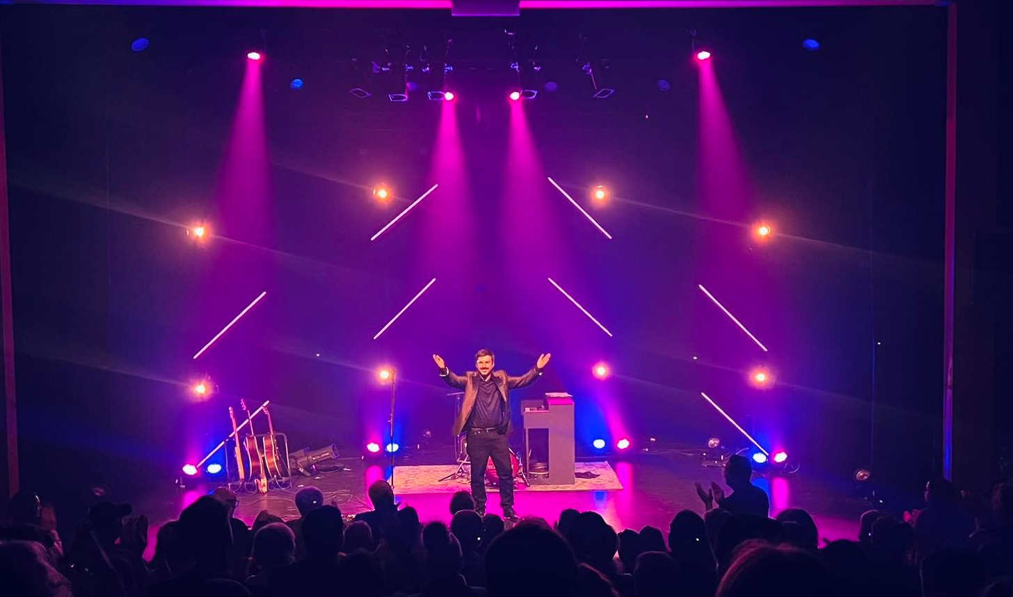
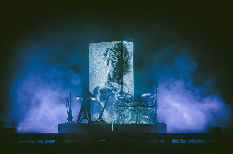
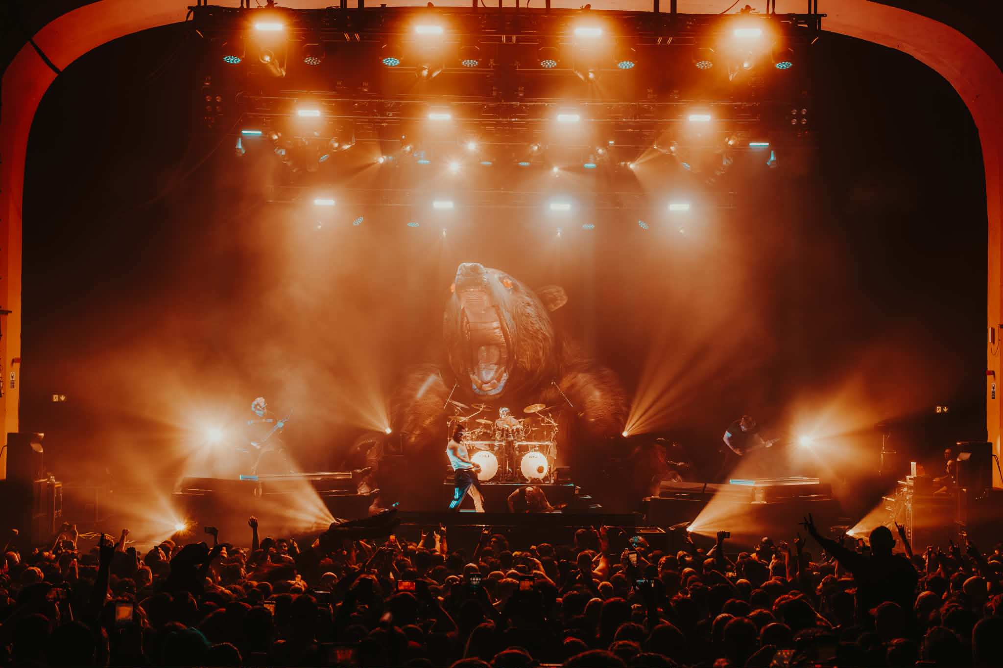
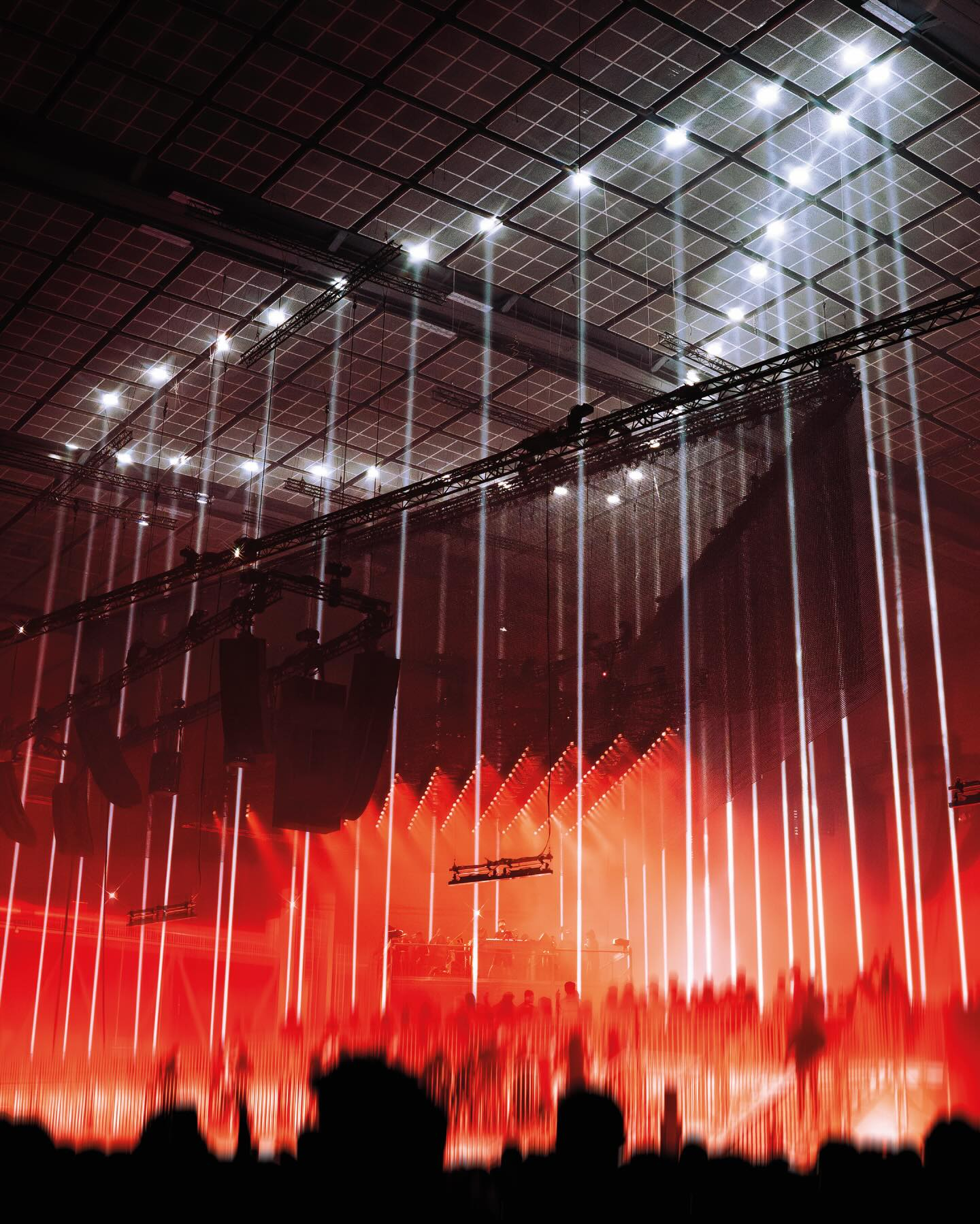
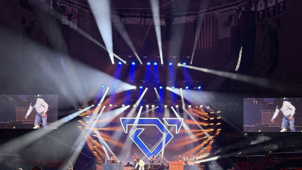
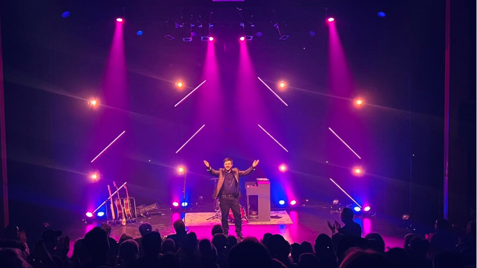
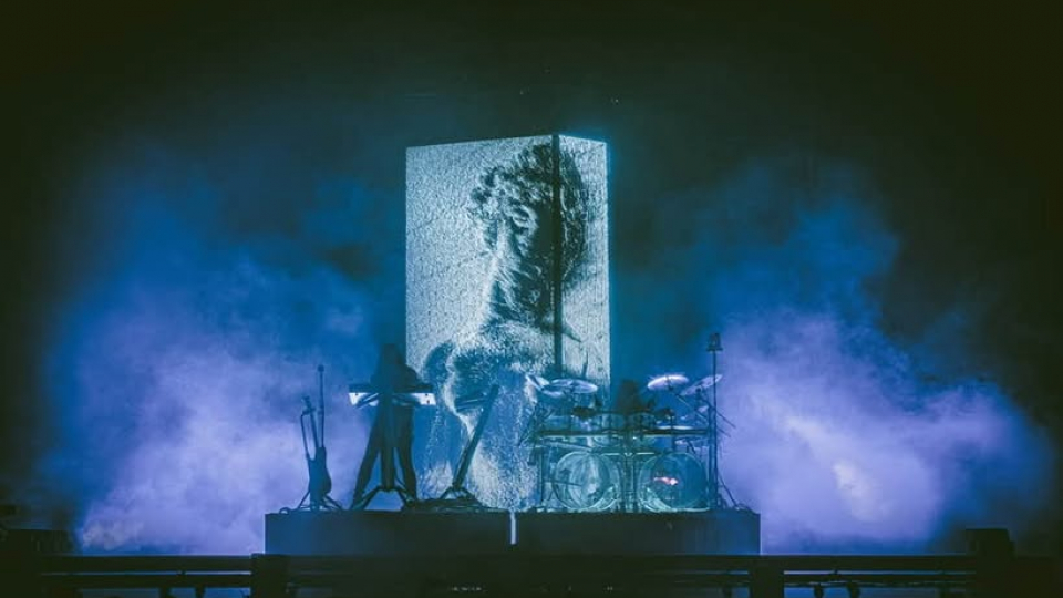
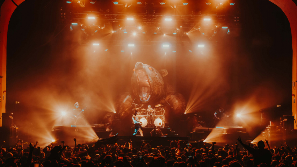
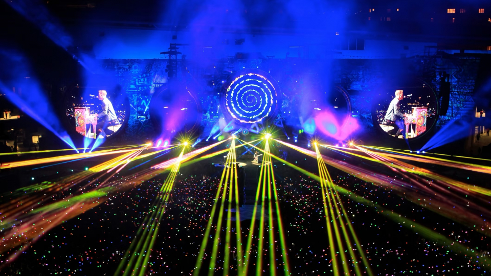
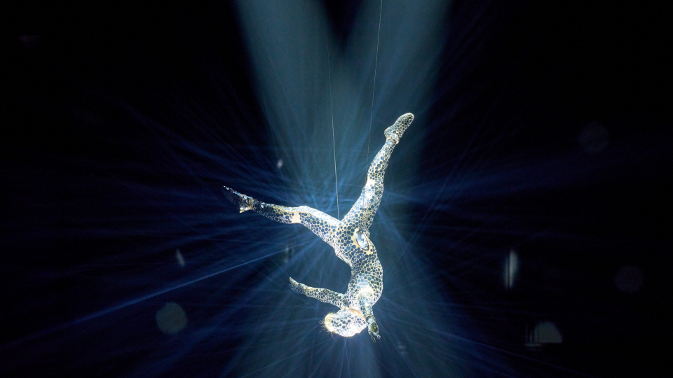
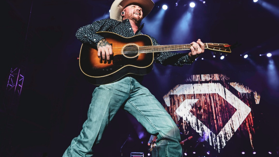
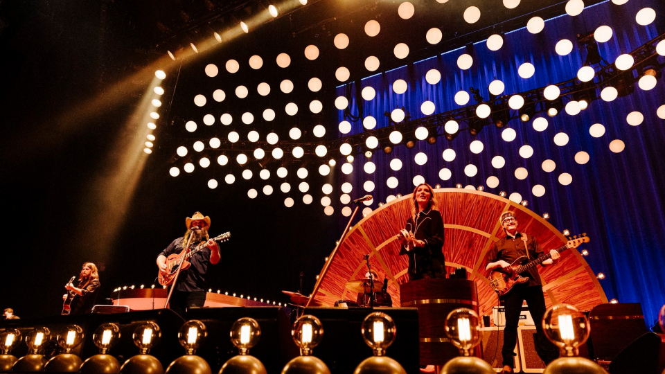
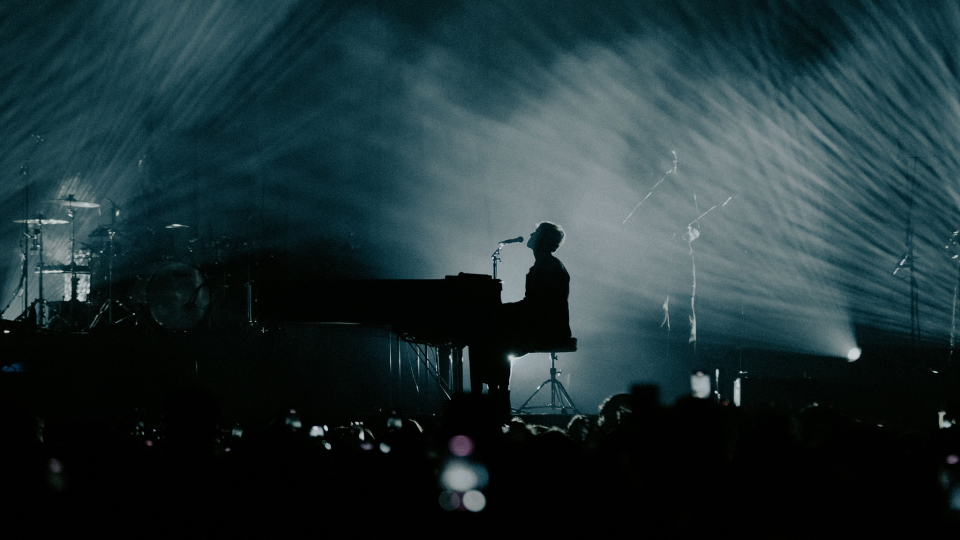
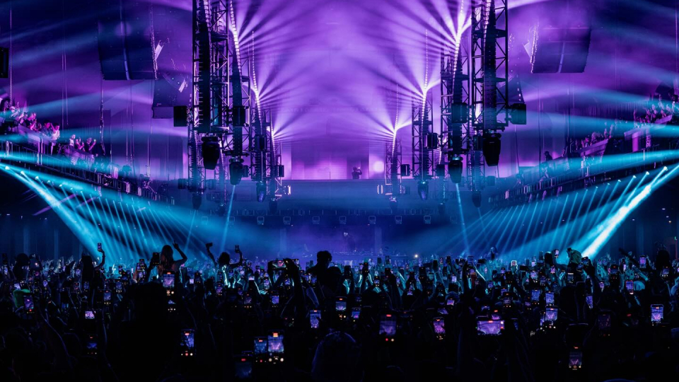
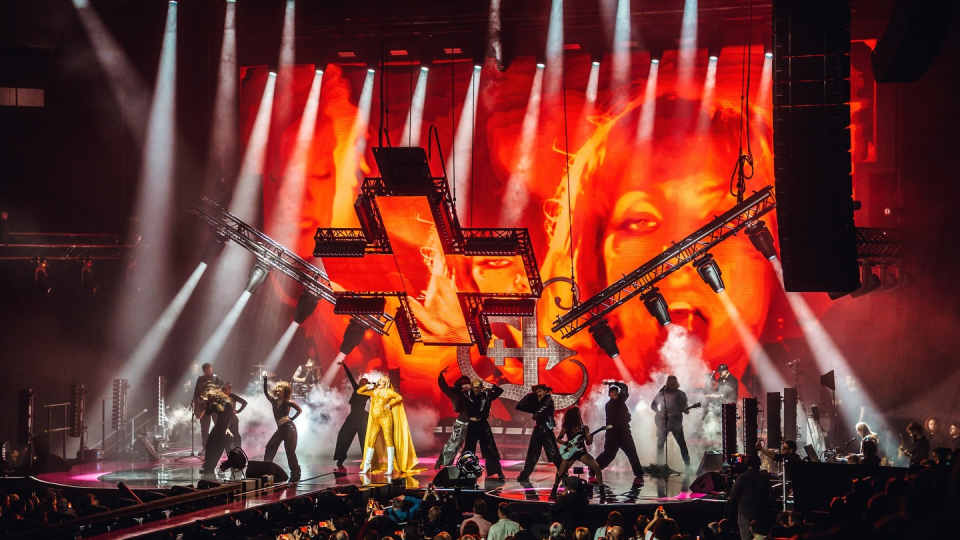
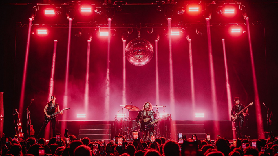
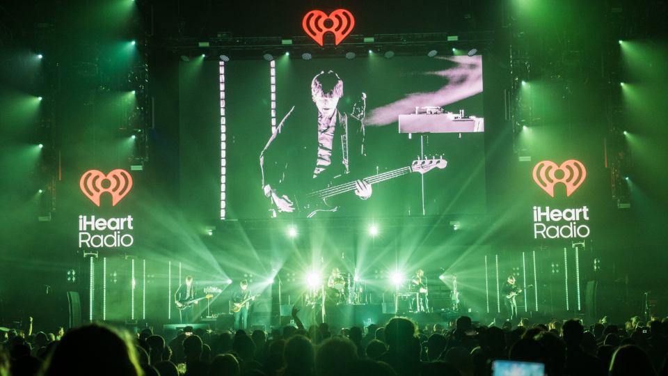
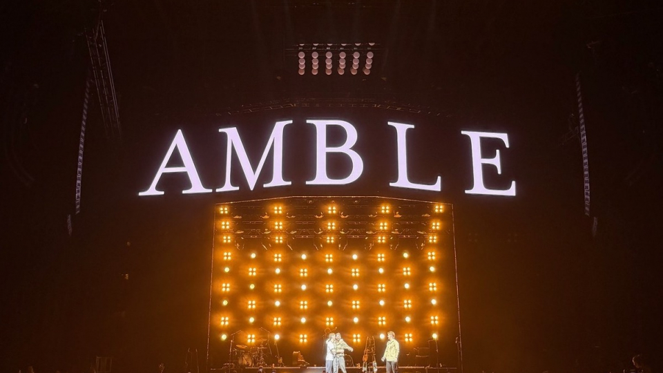
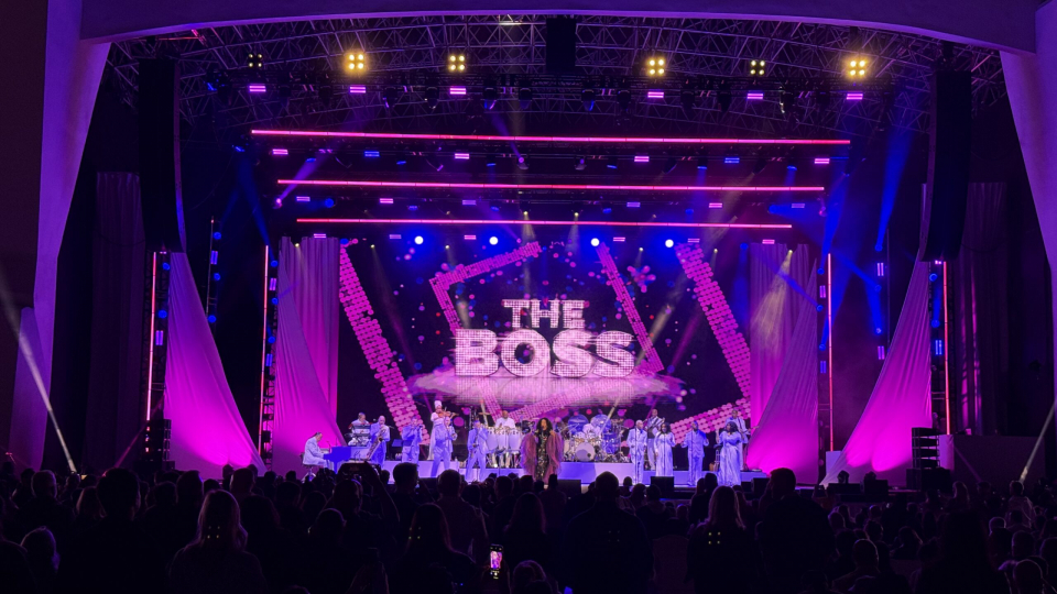
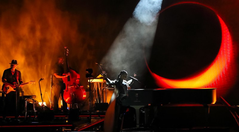
 This Boston based designer has enriched an eclectic mix of projects with light during the course of his highly successful career, from product launches by Fortune 500 companies, to museum exhibits and television broadcasts, to tours by the likes of Alicia Keys, Cardi B, Lenny Kravitz and Gwen Stefani. Despite the varied nature of these endeavors, all of them, even those that do not involve concerts, are touched by the same animated sense of musicality.
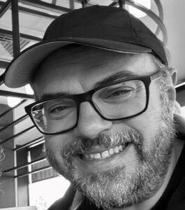
Having trained as a classical musician since a young age, Bryan Barancik always strives, as he describes it, “to find a way to make things musical.” The sense of musicality he instills in his designs are not akin to simple ballads, but more like compelling, richly textured orchestral pieces, with powerful architectural elements that serve as structural patterns to define space and evoke moods. Shadows, darkness and sihillouetes, artfully juxtaposed to light are also present in many of his designs, endowing them with added depth and complexity. This was beautifully evident in his work for Lenny Kravitz’s European tour.
Possessing impressive collaborative skills, something important in both music and design, Barancik has worked on tours with many other gifted designers, such as Steve Cohen on the Eagles tour and Baz Halpin on tours by Taylor Swift and Pink, where his finely tuned sense of harmony was an invaluable asset.
Speaking to us from his Luxious Creatives studio, Barancik shared his insights into the musicality of light.
We have to start off by asking about your company’s evocative name. As far as we can tell there is no word “luxious, ”in the dictionary, but it certainly conveys an image. Can you tell us how you came up with it?
“Just out of college in 1998, my friend Andrew and I decided to go into business together. We met some friends at a bar, and offered a single dollar to whoever came up with the best name –remember the movie Trading Places? Our friend Nettie said “luxious” and it stuck.”
You’ve been very successful in conveying a wide range of emotions in light for your wide range of clients. Which emotional state do you feel is most difficult to reflect with light?
“That is a really interesting question. If I had to narrow this down, I think desperation would be the hardest for me to help convey with light. It’s really not something I’ve come across that I can recall, but when I think of properties of light and design, it feels like it would take an extraordinarily complex but delicate balance of lighting dissonance and harmony.”
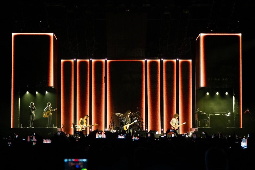
 Your lighting for Lenny Kravitz’s recent EU tour was built, at least in part, around Brutalism, a school of design that emphasized stark form over ornamentation. What about this concept made it a good design motif for this Lenny Kravitz tour?
“Our creative team, including Ray Winkler from Stufish and Fatima Robinson, really helped guide Lenny to various places. After a while, Lenny gravitated to the Brutalism because of its weight, simplicity, and ability to be both modern and classical. It resonated with him quite a bit with respect his desire to be surrounded and feel that his performance space was transformative,but not too glitzy. The first leg of the tour was mostly larger festivals in Europe, so the design was intended to feel almost a bit menacing in some of these stages, then expansive in the few arenas of the summer leg. Any sort of ornamentation was intended to be done musically and then supported by visual media –lighting, video, fog, etc. within the confines of this unusual environment.”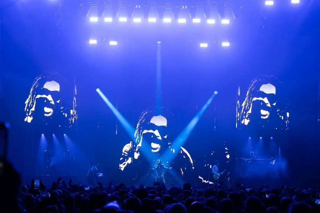
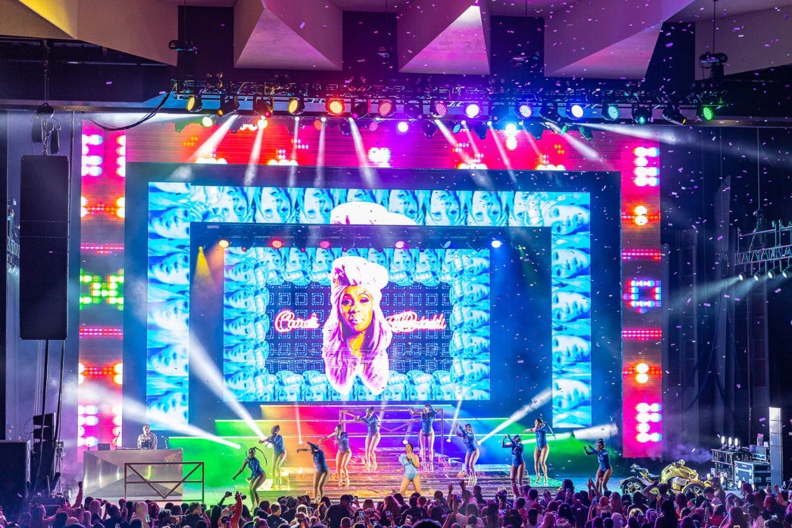
Brutalism was primarily associated with architecture. There was definitely a strong architectural element in the Lenny Kravitz show with the Stufish design and your lighting. We see an architecture-like quality in much of your other work, like the Cardi B World Tour and others. Do you think in terms of architecture when lighting?
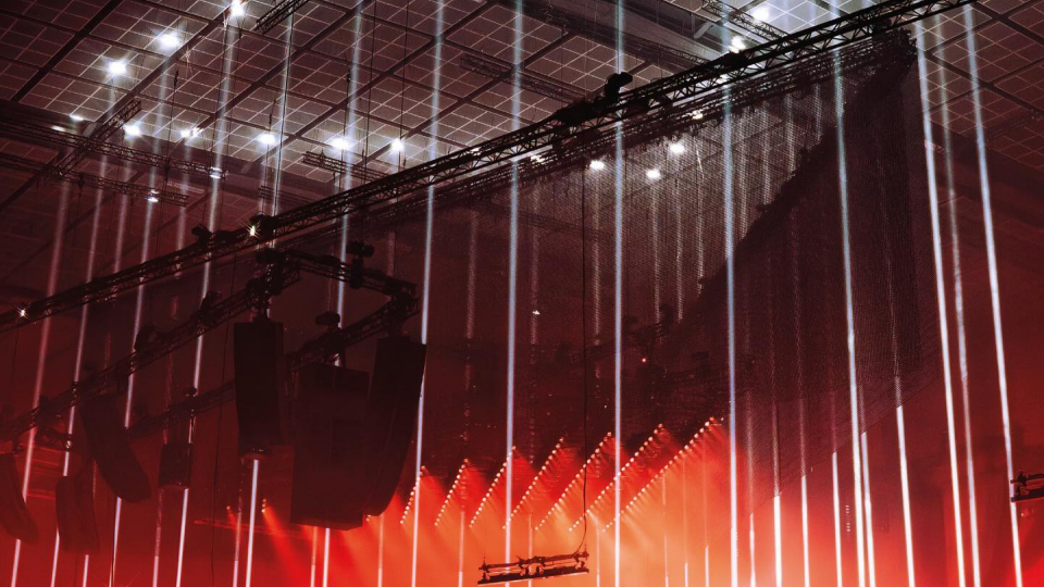
“I learned many years ago through one of my main mentors, Steve Cohen, that if you design your stage and lighting system architecturally well, the lighting will often cue itself. There’s a lot of truth and value to that. Negative space is just as important as light or visual media, arguably more important these days with so many video surfaces used in design. So, I tend to enjoy the architecture of the layout as much any other design element — even more so, I like to highlight it when appropriate.”
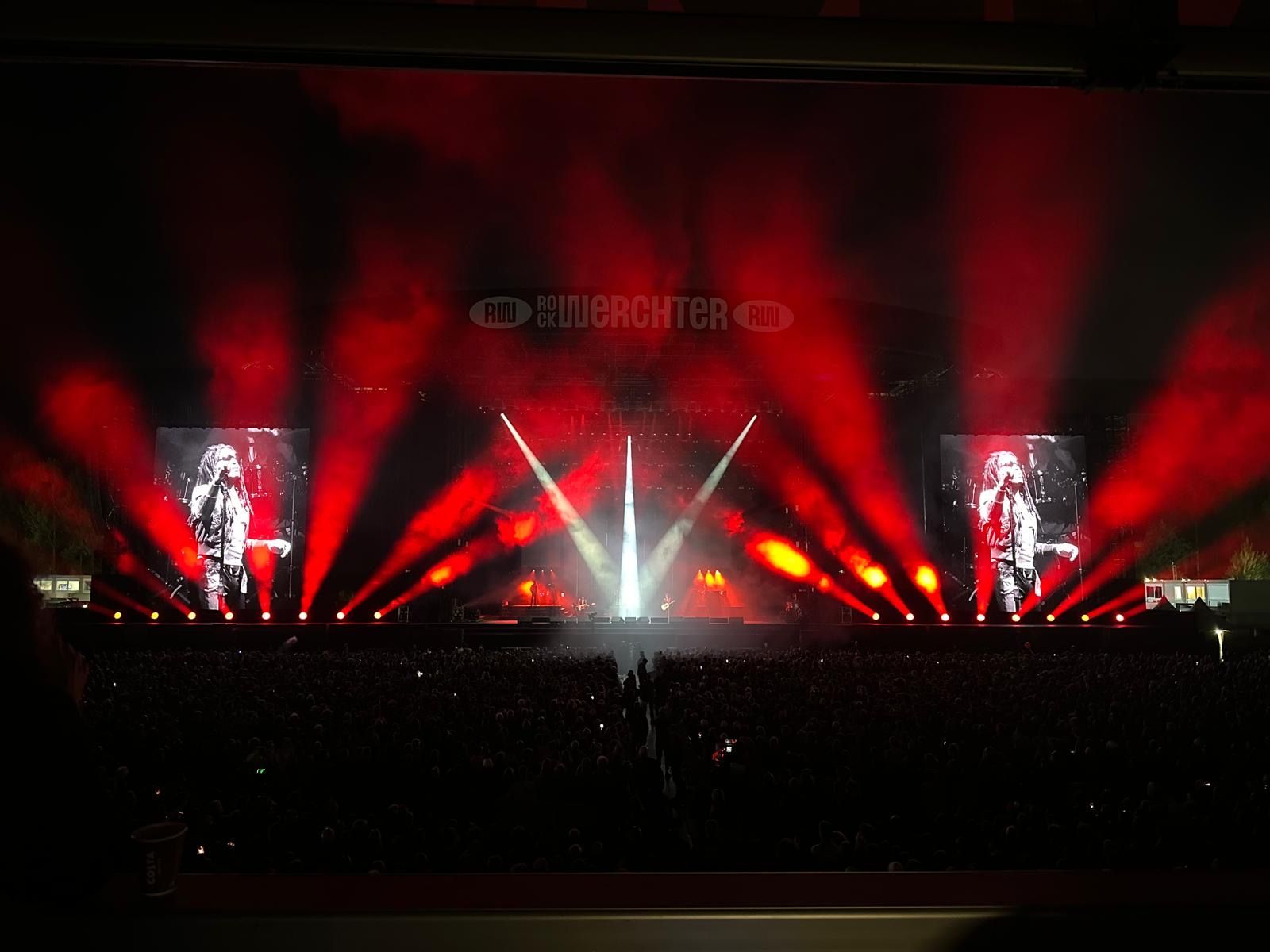 You just mentioned dark space. That’s another thing we see you make use of quite often. Can you share some insight into the role you see darkness playing in your designs. Also, are there times in a show when you’re more or less prone to use darkness?
“As I just touched on, I think dark space is crucial – negative space is just as important as positive space, especially with light and media. Blackouts don’t have to be only at the end of a song; they also serve purposes throughout musical journeys. But darkness isn’t just about blackouts – it’s about shape, space, emotion and focus. And darkness doesn’t have to be about a beam of light with space next to it. I really enjoy more profile lighting because the dark side of someone’s face tells so much more of the story than the illuminated side, especially on camera in a closeup. So, it’s always important to remember that darkness comes in many forms. It’s the balance of its use that makes it so effective.”
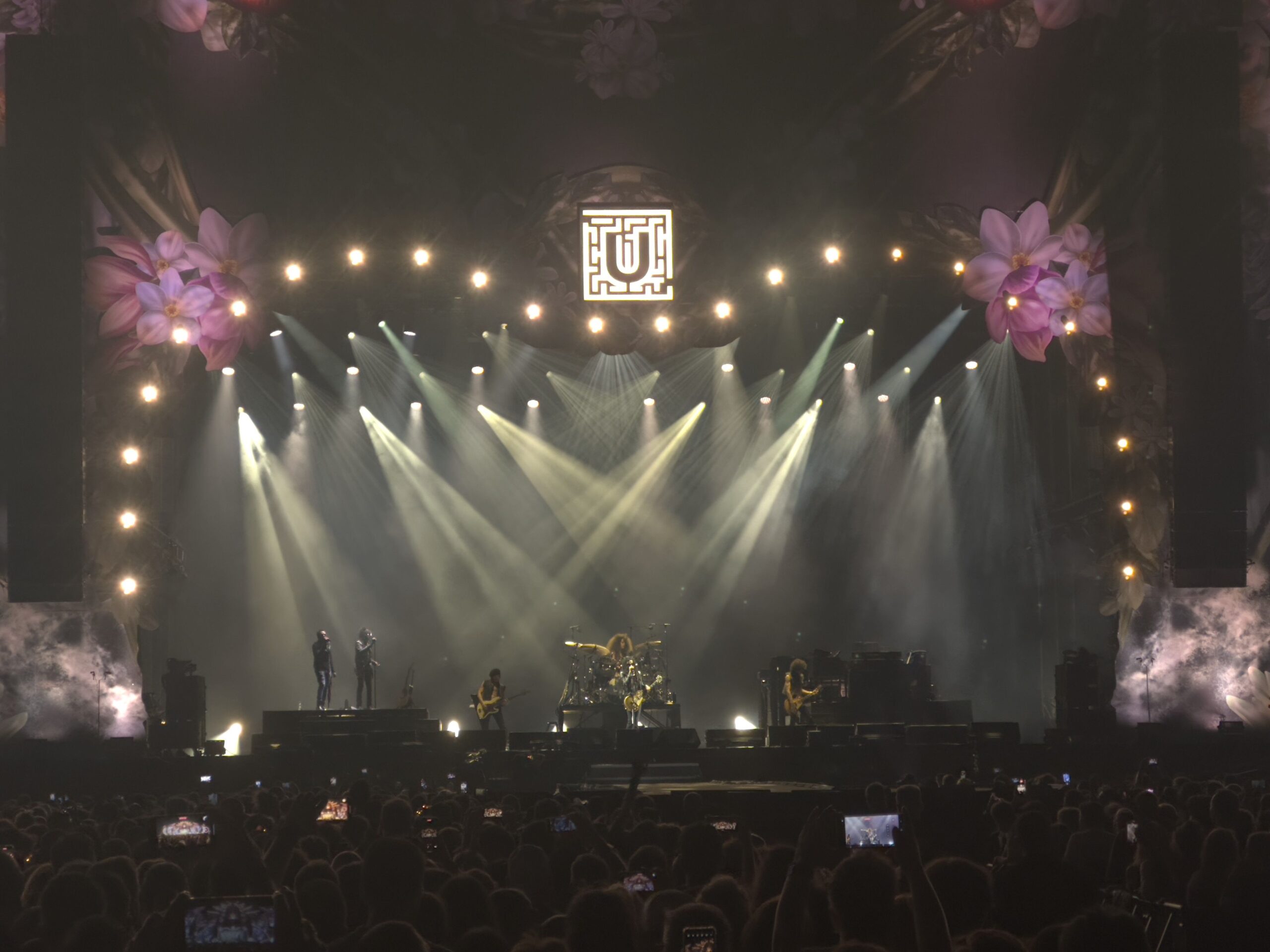 We know you always want to reflect the music of clients in your design, but what about their personalities? Does a client’s personality influence your decision regarding how you will go about lighting the show?
“It’s their show, their performance. We light them so the audience can see them, and so the audience can be taken on the journey the artist wants to provide. In the end, their music tends to be infected by their personality; so often times the lighting design reflects that without much effort. Or at least when we get it right.”
Do you have to like a client’s music todo a good job lighting it?
“I need to respect it and appreciate it, but I don’t have to like it. Often times if it’s not my cup of tea, I do end up finding parts I enjoy.”
You won a Redden Award with Steve Cohen and Seth Jackson for your work on Star Wars In Concert. At the time you described the project as “a lifelong dream come true.” Can you elaborate on why? What do you feel is special about marrying lighting and film?
“SWIC was 100-percent a dream come true. The whole experience, from concept to performance was surreal. It was exhilarating working with a live orchestra in a concert environment. But it was the fact that we were ‘focused’ on the arrangements, and the story of the music, and how John Williams was able to weave motives and themes throughout the films. And we were able to highlight that with a bit of glitz but a lot of emotion. The show was not just playing the score under the film. The films were re-edited using the musical motives JW created. It was much so much more layered and interesting for the audience, and it gave us so much visual emotion to support. The lighting was able to be powerful and discreet at the same time. Very cool.”

That particular tour was one of the early harbingers of the multi-media convergence of different design elements, such as lighting, video, SFX and audio coming together in a seamlessly integrated production. This trend has continue to grow. How do you think thisconvergence changes the nature of lighting and the role of the lighting designer?
“The lighting designer will always be a collaborator. We have to work from the beginning of the process all of the way throughout the performance. By our nature we have always needed to be the glue that holds elements together. But these days it’s even more so because of how much IMAG integration there is now. There are big screens everywhere, and faces are always on the screens. So, I think the lighting designer has always been part of convergence in theatre, but now that integrated process has finally become firmly planted in the concert and TV world.”
Of course, you’ve collaborated with two very talented designers on Star Wars in Concert. You’ve also collaborated with other creatives like Baz Halpin and Bruce Rogers to name a few. As projects become more complex, collaboration becomes more critical. So, what are the keys to collaborating with other high-powered creatives?
“Our entire industry is based on collaboration. In college, I learned so much different theatre shows often with different teams. Collaboration was essential. There are so many personalities out there. I learned then to value your own ideas as much as your team’s ideas, but never hold them above their head as better — even though they just might be! That goes for whomever I work with. Respect goes a long way, and it is a two-way street. Just be respectful.”
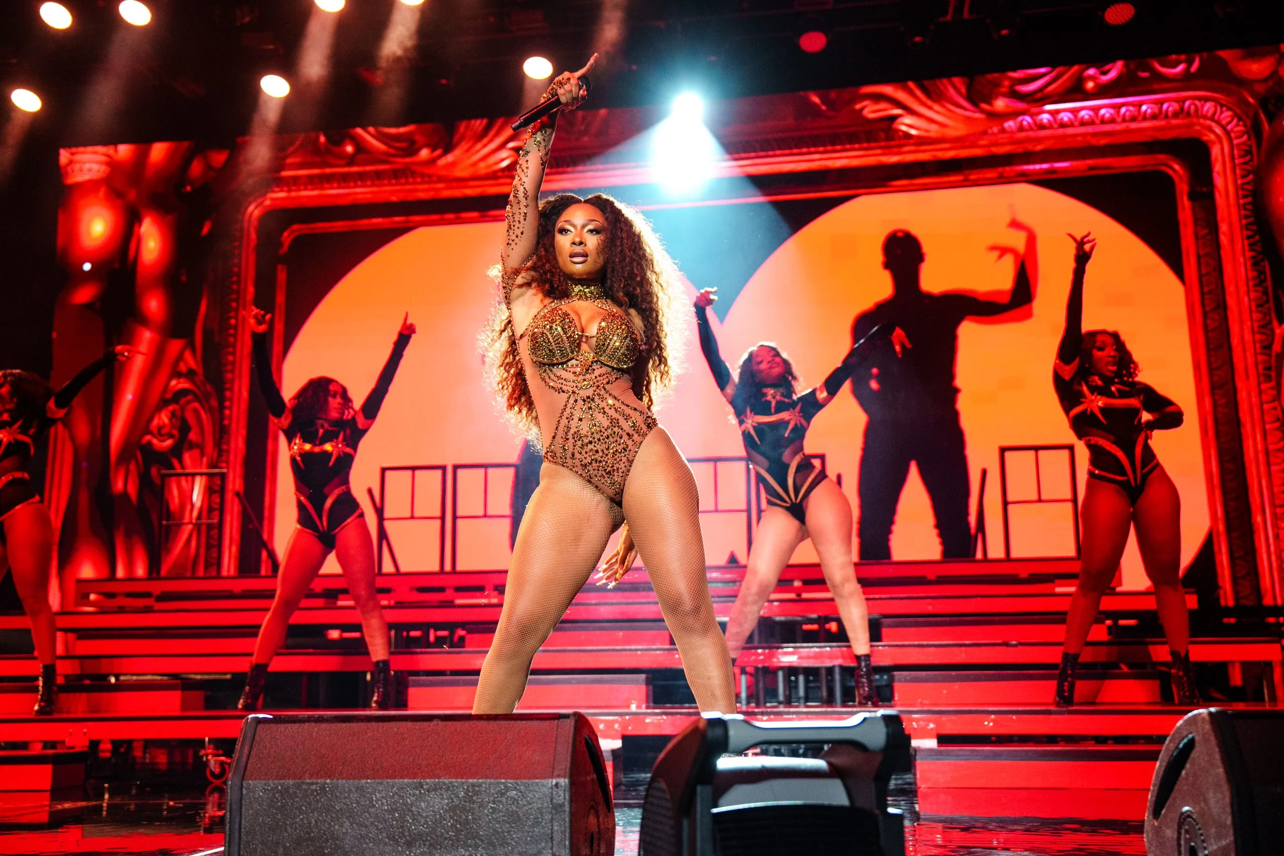
We were very impressed how you use different lighting angles to evoke subtle moods in Alcia Keys’ 2022 tour. Can you tell us a bit about what your creative vision was in that case?
“I had worked with AK for many years prior to that tour, so thankfully going into that tour I had a pretty good understanding of how to support her music in ways she enjoys. And that includes a wide range of lighting treatments. Often, because she is at the piano for at least half of the show, I tend to use a lot of low level, straight and angled back lights flooded out, either with texture or open beam. It allows her to have a “cyc” behind her or be enveloped with texture. For this tour, much of the subtlety was required for her notch IMAG treatments. We would compose those shots within the established visual for the song, and then paint around her to make sure she and the band were sculpted.”
You’ve lit many famous artists, like Lenny Kravitz, Cardi B, and Alicia Keys. Looking back, is there one from the past who is no longer with us, who you would have liked to have lit?
“Actually, I don’t think so. Although I think it would have been really fun to light Mozart in concert. He was pretty eccentric. But those candles would have been hard to program, so it’s tricky.”
In addition to tours, you’ve done a lot of TV work such as the NBA All Star pregame show, as well as attractions and corporate events. What is it about tours that make them different from these types of projects?
“I grew up surrounded by music. Music was my passion, and my college major, as well as really my main talent. In every single thing I do now in my career, I apply musicianship. It doesn’t matter if it’s a musical act or a lectern – I always find ways to make things musical, even if they aren’t obvious to anyone but me. So, for me, tours are the best way I can really apply my musicianship to lighting – breath, phrasing, motives, etc. It’s not all about hits and flashes.”
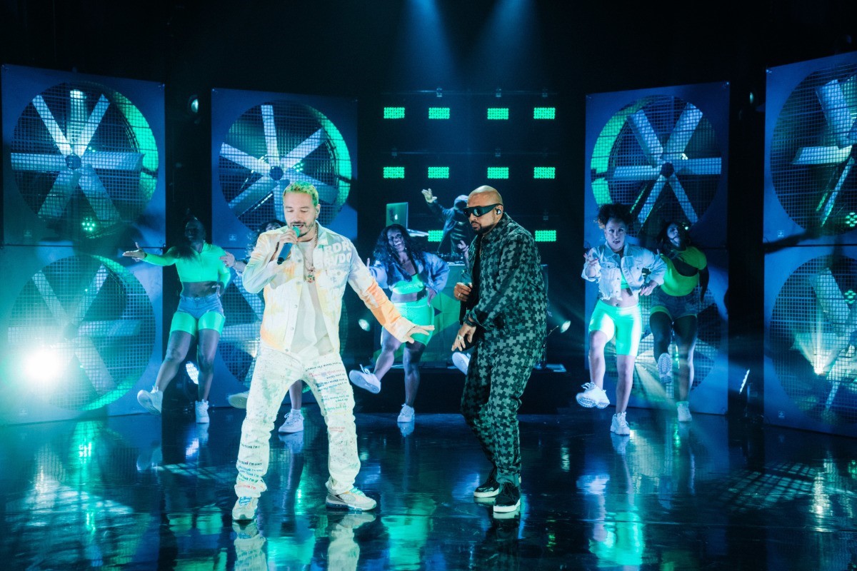
Looking at your career to date, is there one project that stands out as your biggest learning experience? The one that taught a valuable lesson about design?
“All of my projects contribute in their own ways. Many years ago, throughout many different types of design projects, I gained a solid understanding more about who the audience is at that particular show, and how they receive/perceive the performance. Of course, a corporate show is so different than an arena tour, not only in the design and performance aspect, but who the audience is and how you need to help guide them through the story of the show. For me that plays a good role in many of the design decisions, especially cueing. In the Star Wars In Concert show, I learned quickly that musicians cannot have only red light directly on their music – they can’t see the notes!”
From a creative standpoint, what part of lighting design do you find to be most challenging?
“Having the artist see your work in progress before you’re ready to show it. We don’t need to show the artist a final painting, but if they only see the first or second layer of the design cueing, there’s always the risk of misunderstanding the final intentions and how you’re getting there.”
Why did you become a designer?
“I started off programming. In the last 20 years, the role of programmer became more of a designer/programmer combination. And I think that’s important, given all of the technology at our fingertips. In the end, I’m much more of a big picture visual person, even as a show director, than a programmer. It really was a natural evolution.”
 What is the one thing you want people to know about you as a designer?
“Since I was young, I trained as a classical musician. Musicality of design, especially lighting, is so much more prevalent these days as more and more shows rely on timecode. I don’t always like timecode. I don’t tend to live on beats 2 and 4 or just find snare hits and align to them in songs. I like to find the musical phrasing that isn’t as conspicuous and create layers in and around that. All in all, I like taking the road less traveled musically. “
