The Chemistry of Color
Posted on February 1, 2022
Colors are the smiles of nature. So said the English poet Leigh Hunt. Pity he left us in 1859. Had he been around in this age of LED technology, he would have seen that smile radiate in unimaginable new ways.
Of course, you don’t have to be a poet to have your heart and imagination captivated by color. From soothing ambers to searing reds, and icy blues to soft pastels, color moves us in unique and mysterious ways. We may “see” colors as messages sent from our eyes to our brains, but we feel them on a far deeper level.
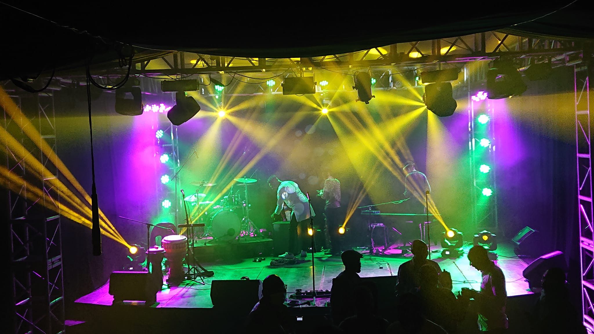
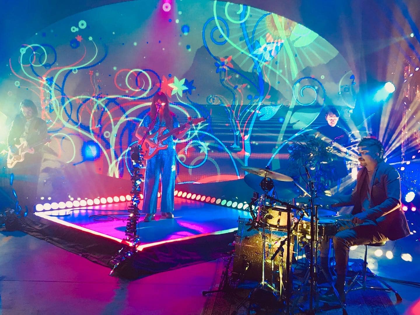
The power of color becomes even more profound when one hue is juxtaposed to another. Small wonder then that fusing different colors is such an important part of lighting design. With this in mind, we asked a broad cross section of designers from throughout the world to share their favorite color combinations.
Jimmy Olausson, Gothenburg, Sweeden
“Everything is relative to what we are seeing on stage and hearing through the PA. So, color is for me an extension of what’s being expressed on the stage. However, on a personal level, a color combination that I love is warm white together with cold white. The two colors are so similar, but yet so far from each other. They aren’t meant to be, but within the right usage, they can blend and create looks that you normally don’t imagine. I love that I can illustrate the artist being cold in a warm environment or vice versa. Doing this, you can create scenes that the ordinary person wouldn’t imagine at first thought.”
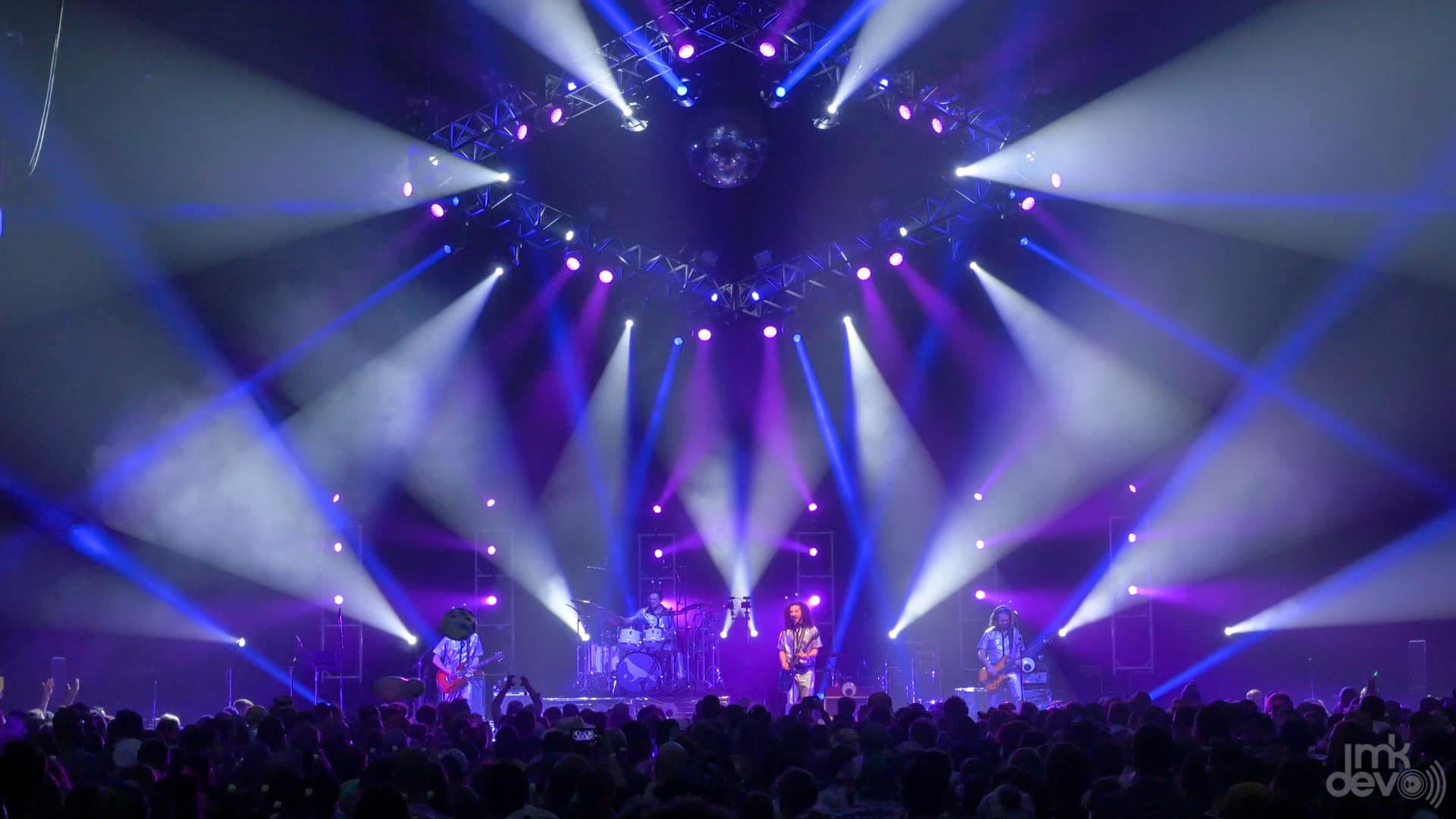
Manny Newman, Baltimore, MD
“My go-to color combo is indigo, yellow, and light green. This combination yells FUNK. which is the motto for my client Pigeons Playing Ping Pong. It gives a fun feeling that makes me wanna just dance and groove to the music. I feel like the Green is where you wanna go more intense with this mix. When I started using this color combo I didn’t use light green. It was straight primary, which was fine, but could have definitely used more pizazz. I started adding white to the green to give it a unique look and it worked beautifully.”
Bernhard Endl, Vienna
“Of course everything depends on the mood of the song or the scenery, so I have no absolute favorite. However, I love the combination of 180 and 115 for “deep” pieces.
It combines perfectly with amber tones. Let’s say you have this combination on stage and at the chorus some amber (135,021,134) rises, including a gently move into an asymmetric look which supports the depth of the picture you create. I like its ‘darkness,’ and that you are able to evoke many different feelings. Imagine you have a heavy sound, kind of dee depression on stage, but if the lyrics change at an interlude or chorus, into something with hope or joy, you’re able to light a kind of sunrise with the use of an amber tone. Amber blows the bad feelings away For example, you have 180 as a ground wash, headlights for artists in 115, sidelights right 115, and sidelight left 180. And then, at the moment of hope at the chorus you fade in your spots in a 135 and change the 115 side lighting into 135 as well. In my view it creates a feeling of confidence. Like the first sunbeams reaching land after a heavy thunderstorm.”
Mason Felps, Nashville
“I really like using amber and magenta. You can really make things pop with more amber or you can set a mellow tone with magenta. Amber is also great for exciting happy feelings and magenta can make a deep, almost sad, feeling with magenta. To me, amber will always be the more intense color for the hard hitting moments/chorus’s to the songs that I am programming.”
Nicky Sintara, Harare, Zimbabwe
“Blue, white and amber are what’s best for me. Why do l like these colours? It’s just because they produce better quality on cameras, and are easier to balance. They create a day feeling on stage — with haze they will look like clouds moving in the sky, especially when you add some gobos and beams.”
Robert Henderson, Basingstoke, UK
“One of my favorite colors to use in combinations is GAM 920 Pale Lavender. At high intensities it can appear quite cool, but at lower levels, it takes on a surprising warmth. It’s relative neutrality as a color, which allows it to combine flexibly with other lighter shades. Combined with something like L162 (Bastard Amber) or L159 (No Color Straw) it works as a cool contrasting color, but with something like L202 (half CT Blue) it works as the slightly warmer color of the combination. Despite the huge advances of LED technology I am still not a huge fan of the way LED light interacts with human skin. I find that frequently I am using LED units for atmosphere creating back and side light and using combinations of 920/162 or 920/202 to tease out the faces from the front. I find that the 920 in particular is flattering to a good range of skin tones. I would point out that GAM color is very difficult to source in the UK, so I often find myself having to use L053 or R53 instead. These are very slightly darker but work in pretty much the same way.”

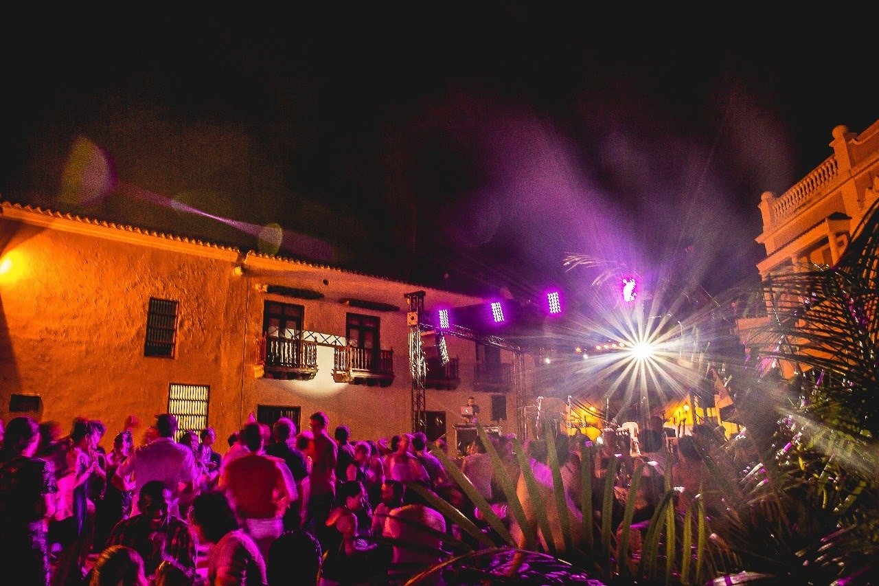
Victor Cervantes, Cartagena, Colombia
“I really like amber and take it to various shades. At the venues where we work, it is the color we use the most to accent the colonial architecture. But there are other combinations that we love to work with, such as magenta and red. They are colors that give character to the stage and transmit intensity in its maximum expression.”
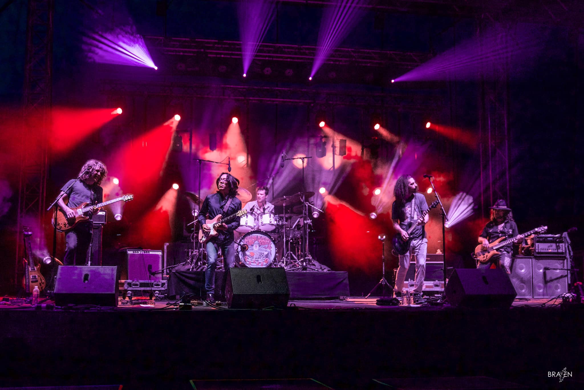
Cody James, Cranston, RI
My two color combination is probably red and amber. It you’re talking three colors, it’s magenta/cyan/green. I like red and amber; it helps push aggression on a breakdown or big yell, but also allows you to be subtle and gentle during a chorus or instrumental. Magenta, cyan and green is just one of my favorite combinations. It really just blends perfectly and makes for a giant feel. As far as the preference of which color gets the bump of intensity, it really depends on the song. For example, if I am in the three color magenta/cyan/green look and it’s a big gobo chorus sing along part, I’m gunna put my spots or profiles in the cyan, so when I fly it out and drop in the gobo it cuts through the saturation of the rest of the rig.”
Érik Nowosielski-Lamoureux, Laval Quebec
“It really depends on style. I think the combination I end up the most using is red and white. White is great especially with low output fixtures because that’s where you get the highest output! Also it’s common; so it’s a safe color to use at the start of any song. Red is really contrasted, and it makes a really intense look! It’s great for rock songs, but works very well for slow romantic songs too! Red can be felt as pain and anger, but also as love and passion. Red is just a color that represent intensity, so it’s really good to add songs when that’s called for! And white represents purity so it comes balance out the red really well. Another combination I really love but have not used very often is magenta and yellow. It’s not common at all to see that combination. They are completely opposite, so the combination can trigger something in the eye that you are not used to seeing. I really love to use this combination for anything that feels psychedelic! It helps to enhance the psychedelic feel. I’m a huge fan of asymmetrical looks, so magenta and yellow really suits my lighting style and designs. I’m a huge Pink Floyd so it’s probably from where this style comes from!”
Jimmy Davidson, Waco Texas
“If I had to pick one combination, it would be Congo blue and magenta because you can really cool a stage down and make the band stand out while creating a lot of pop down stage color with this scheme. Typically, I will be a bit heavier on the blue side as you can still keep a darker stage and still have enough light intensity to see the band.”
Niklas Fuchs, Vienna
“It is hard to pick a favorite color blend, as it very much depends on the song or scene! However, I love the combo of a very dark Congo blue/lavender with a very pastelly yellow/warm white tone. This gives you a great way to create depth on stage when you carefully pick which fixtures project dark color and which the bright color. A dark/bright color combination also makes it easy to set accents, but still have the whole stage lit. A deep blue color is always great for mystical scenes, but also works well for sad songs. Personally I don‘t think there is a “right“ color for a particular scene. There may be some wrong colors, but in the end it is a personal opinion of the designer and/or artist.”
Rodger Pugh, Tempe AZ
“CTO(or straw) / Red A2-4 is it for me! The combination creates a dirty, gritty almost mysterious feel to the stage, while maintaining and balance between dark and light. When the wash is the CTO and the accents (spots/beams) are the reds it creates a bright yet moody stage and alternatively when the wash is red and the accents are CTO, it creates a dark stage with streaks of stark contrast. It’s a combination that works for ballads and heavy tracks.”
John Berret, Augusta, GA
“I have a couple of sets of colors I like to combine. Magenta and cyan is one. To me, these colors make me feel happy. I generally use these ones on bands that are playing fun music.. Dark blue and yellow is another favorite. They make me feel power. Like when a band is just killing it on stage I’ll go to this and it just makes everything feel like it’s popping. The last one I use a lot are blue/red/magenta/purple and white. Any of those colors and hitting the beams white makes everything explode. I love it. It feels like old school rock concert when I do this. There’s nothing like an army of beams rolling solid big bars of white light that you think you could grab ahold of and hang on to. I love it when they’re hitting the tiniest smallest gobo with all the prisms on. Any of those colors with white beams really feels big and full of energy for me.”
Gerry Dintelman, St. Louis, MO
“Color is so subjective, and it depends on the feel of a song, but if I had to pick one, I’d say my favorite color combination would be cyan and UV. 2. What I like most about this color combination is how bold and versatile it is. It works well with almost every other color, and can work with multiple different moods. I also find that it looks great in pictures. Depending on what the song is asking for, you can add a third color to change the feel of the palette. Add magenta and make it intimate, add some green to make it look creepy, 10,000K white to make it a little more neutral, or even add some amber or yellow to warm it up and give it more of a complimentary look. The best way I’ve found to use this color combination is UV back/hairline wash, cyan key/front wash, and a third color for beams and accents. It’s an easy combination for me to over use, so I try not to use it too often, but when I do, I always love it.
Sam Jimenez, Las Vegas
“My favorite combo changes often. But as of right now, I would say my favorite is deep full saturated red and sea foam green. I find using red on the lights lower in the rig and the SF green in the lights higher in the rig. To me it evokes like a sci-fi sort of evolving look.”
Luke Bonner, Melbourne Australia
“I have a lot of favorite color combinations that I go to, depending on what’s happening on stage. However, I do generally like paler colors, such as Pale Blue (L063), and mixing green until I get a dirty, gas-light green. I also like light lavenders, such as Lilac Tint (L169) or Pale Lavender (L136). These colors aren’t heavy enough to try and compete with each other too much. Also, I know white isn’t really a ‘color’ but I do love using it around 4500K.
In general, I like lighter colors that can bring out whatever is happening on stage without being overwhelming. Because they’re not heavy or saturated, they’re easily switched around and then switched between different positions, such as front, top, side etc. or even used from opposite sides in combination. The blue might a reveal a cooler scene in a base color, around water, sky, ice, evening etc. but not as cold as using open white (6500K).
The green was something I’d found, wanting a pale green, but with a little yellow – almost confusing. The lavender is more of hint of color to keep things visible and maybe even ‘visibly dark’. You can see what’s happening onstage, but again it doesn’t overwhelm. Of course, using the white over the top of color will make whatever is being illuminated appear ‘brighter’. But I think to make more intense, I try and provide as much separation as possible between whatever is needing to be lit. “
Dara Guiney, Providence, RI
“I love a good green and magenta. I remember first using it with a metal band years ago and the guitarist saying one day in sound check how he loved the Hulk colours. I never associated it with the Hulk up until then, and I’ve always called it the Hulk since. I really like it because I find it is hard to pull off this color and make it look decent, but when it does work it is blissful. Garbage’s last album cover was printed in Green and Magenta colors , so a lot of the new songs in the set were in green and magenta backlight with nice CTB front light for spots. My preference of color for more intense looks would be green added with a nice cool open white for a bridge, but I find magenta works as well depending on the song’s emotion.”
David Beebe Washington DC
I like the obvious –well, obvious to me at least: red and blue. Red used to be my favorite color, but I lean to blue more now. I prefer darker moodier looks with teal and magenta, also blue & a deep amber. I lean toward blue and red for a fairly neutral look, and blue with green or teal for a deeper, moodier feel. Then there’s amber and blue for a brighter moody feel and more of the blue/teal/magenta for a festive feel.”
Chris Kratz, Reading PA
“I find it very hard to choose a particular color or scheme of colors because being a 99.99-percent punting LD I try to mix it up on a nightly basis, throwing as many color combos as I can each night — or at least trying not to repeat one set too many times. If I had to absolutely pick one, and living in a, primarily LED world, I tend to always come back to that solid LED blue, mostly because you get that rich blue hue, but also a slight sense of UV when bouncing off certain bright colors. LED Blue also blends well, either snapping or fading, into any other color on the traditional rainbow spectrum. Of course when you snap it with red, you get the police siren effect; so I would say that optically those two combinations are the most intense for the viewer .”